The Overlay chart in Figure 2.10 shows multiple projects’ simulated costs or schedules overlaid on top of one another to see their relative spreads, location, and skew of the results. We clearly see that the project whose distribution lies to the right has a much higher cost to complete than the left, with the project on the right also having a slightly higher level of uncertainty in terms of cost spreads. Refer to the appendices for more details on interpreting these PDF and CDF charts, as well as on how to make better-informed decisions using their results.
Finally, Figure 2.11 shows an Analysis of Alternatives comparison of the simulated results of the projects. While Figure 2.9 shows the expected value of the project costs and schedule (not simulated, static, single-point estimates), Figure 2.11 shows the simulated results.
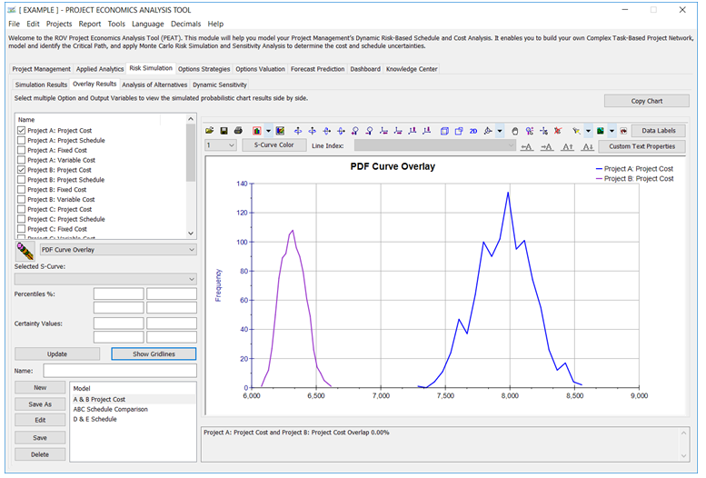
Figure 2.10: Overlay Charts of Multiple Projects’ Cost or Schedule
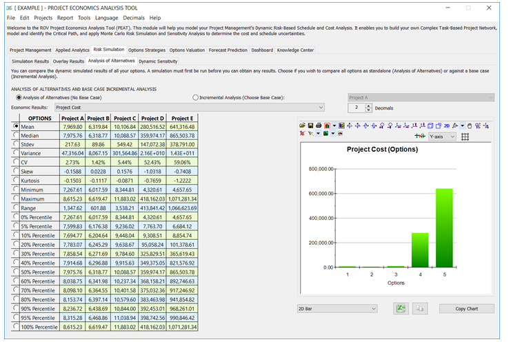
Figure 2.11: Analysis of Alternatives