File Name: Sensitivity – Tornado and Sensitivity Linear
Location: Modeling Toolkit | Sensitivity | Tornado and Sensitivity Linear
Brief Description: Illustrates how to use Risk Simulator for running a pre-simulation sensitivity analysis (tornado and spider charts) and running a post-simulation sensitivity analysis (sensitivity charts)
Requirements: Modeling Toolkit, Risk Simulator
This example illustrates a simple discounted cash flow model and shows how sensitivity analysis can be performed prior to running a simulation and after a simulation is run. Tornado and spider charts are static sensitivity analysis tools useful for determining which variables impact the key results the most. That is, each precedent variable is perturbed a set amount and the key result is analyzed to determine which input variables are the critical success factors with the most impact. In contrast, sensitivity charts are dynamic, in that all precedent variables are perturbed together in a simultaneous fashion (the effects of autocorrelations, cross-correlations, and interactions are all captured in the resulting sensitivity chart). Therefore, a tornado static analysis is run before a simulation while a sensitivity analysis is run after a simulation.
The precedents in a model are used in creating the tornado chart. Precedents are all the input variables that affect the outcome of the model. For instance, if a model consists of A = B + C, and where C = D + E, then B, D, and E are the precedents for A (C is not a precedent as it is only an intermediate calculated value). The testing range of each precedent variable can be set when running a tornado analysis and is used to estimate the target result. If the precedent variables are simple inputs, then the testing range will be a simple perturbation based on the range chosen (e.g., the default is ±10%). Each precedent variable can be perturbed at different percentages if required. A wider range is important as it is better able to test extreme values rather than smaller perturbations around the expected values. In certain circumstances, extreme values may have a larger, smaller, or unbalanced impact (e.g., nonlinearities may occur where increasing or decreasing economies of scale and scope creep in for larger or smaller values of a variable) and only a wider range will capture this nonlinear impact.
Creating a Tornado and Sensitivity Chart
To run this model, simply:
- Go to the DCF Model worksheet and select the NPV result (cell G6) as seen in Figure 130.1.
- Select Risk Simulator | Analytical Tools | Tornado Analysis (or click on the Tornado Chart icon).
- Check that the software’s intelligent naming is correct or, better still, click on Use Cell Address to use the cell address as the name for each precedent variable and click OK (Figure 130.2).
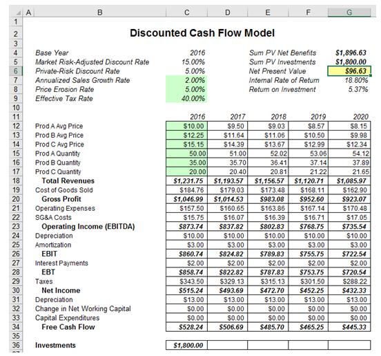
Figure 130.1: Discounted cash flow model
Interpreting the Results
The report generated illustrates the sensitivity table (starting base value of the key variable as well as the perturbed values and the precedents). The precedent with the highest impact (range of output) is listed first. The tornado chart illustrates this analysis graphically (Figure 130.3). The spider chart performs the same analysis but also accounts for nonlinear effects. That is, if the input variables have a nonlinear effect on the output variable, the lines on the spider chart will be curved. Rerun the analysis on the Black-Scholes model sheet in the tornado and sensitivity charts (nonlinear) example file.
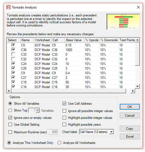
Figure 130.2: Setting up a tornado analysis
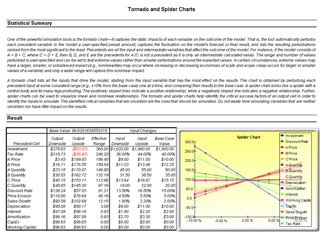
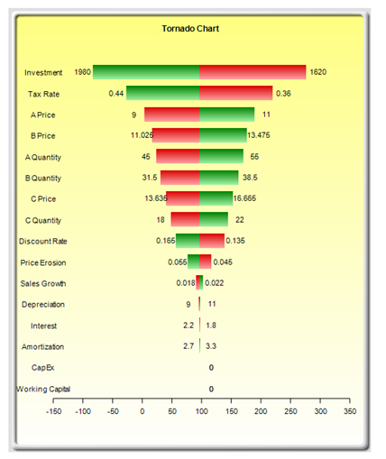
Figure 130.3: Tornado analysis result
The sensitivity table in Figure 130.3 shows the starting NPV base value of $96.63 and how each input is changed (e.g., Investment is changed from $1,800 to $1,980 on the upside with a +10% swing, and from $1,800 to $1,620 on the downside with a –10% swing). The resulting upside and downside values on NPV are –$83.37 and $276.63, with a total change of $360, making it the variable with the highest impact on NPV. The precedent variables are ranked from the highest impact to the lowest impact.
The spider chart illustrates these effects graphically. The y-axis is the NPV target value while the x-axis depicts the percentage change on each of the precedent values (the central point is the base case value at $96.63 at 0% change from the base value of each precedent). Positively sloped lines indicate a positive relationship or effect while negatively sloped lines indicate a negative relationship (e.g., investment is negatively sloped, which means that the higher the investment level, the lower the NPV). The absolute value of the slope indicates the magnitude of the effect computed as the percentage change in the result given a percentage change in the precedent (a steep line indicates a higher impact on the NPV y-axis given a change in the precedent x-axis).
The tornado chart illustrates the results in another graphical manner, where the highest impacting precedent is listed first. The x-axis is the NPV value with the center of the chart being the base case condition. Green (lighter) bars in the chart indicate a positive effect while red (darker) bars indicate a negative effect. Therefore, for investments, the red (darker) bar on the right side indicates a negative effect of investment on higher NPV––in other words, capital investment and NPV are negatively correlated. The opposite is true for the price and quantity of products A to C (their green or lighter bars are on the right side of the chart).
Although the tornado chart is easier to read, the spider chart is important to determine if there are any nonlinearities in the model. Such nonlinearities are harder to identify in a tornado chart and may be important information in the model or provide decision makers important insight into the model’s dynamics. For instance, in the Black-Scholes model (see the next chapter on nonlinear sensitivity analysis), the fact that stock price and strike price are nonlinearly related to the option value is important to know. This characteristic implies that option value will not increase or decrease proportionally to the changes in stock or strike price, and that there might be some interactions between these two prices as well as other variables. As another example, an engineering model depicting nonlinearities might indicate that a particular part or component, when subjected to a high enough force or tension, will break. Clearly, it is important to understand such nonlinearities.
Remember that tornado analysis is a static sensitivity analysis applied on each input variable in the model––that is, each variable is perturbed individually and the resulting effects are tabulated. This makes tornado analysis a key component to execute before running a simulation. One of the very first steps in risk analysis is where the most important impact drivers in the model are captured and identified. The next step is to identify which of these important impact drivers are uncertain. These uncertain impact drivers are the critical success drivers of a project, where the results of the model depend on these critical success drivers. These variables are the ones that should be simulated. Do not waste time simulating variables that are neither uncertain nor have little impact on the results. Tornado charts assist in identifying these critical success drivers quickly and easily. According to this example, it might be that price and quantity should be simulated, assuming if the required investment and effective tax rate are both known in advance and unchanging.
Creating a Sensitivity Chart
To run this model, simply:
- Create a new simulation profile called (Risk Simulator | New Profile).
- Set the relevant assumptions and forecasts on the DCF Model worksheet.
- Run the simulation(Risk Simulator | Run Simulation).
- Select Risk Simulator | Analytical Tools | Sensitivity Analysis.
Interpreting the Results
Notice that if correlations are turned off, the results of the sensitivity chart are similar to the tornado chart. Now, reset the simulation, and turn on correlations (select Risk Simulator | Reset Simulation then select Risk Simulator | Edit Profile and check Apply Correlations, and then Risk Simulator | Run Simulation), and repeat the steps above for creating a sensitivity chart. Notice that when correlations are applied, the resulting analysis may be different due to the interactions among variables. Of course, you will need to set the relevant correlations among the assumptions.
Sometimes the chart axis variable names can be too long (Figure 130.4). If that happens, simply rerun the tornado but truncate or rename some of the long variable names to something more concise. Then the charts will be more visually appealing.
The results of the sensitivity analysis comprise a report and two key charts. The first is a nonlinear rank correlation chart that ranks from highest to lowest the assumption-forecast correlation pairs. These correlations are nonlinear and nonparametric, making them free of any distributional requirements (i.e., an assumption with a Weibull distribution can be compared to another with a Beta distribution). The results from this chart are fairly similar to that of the tornado analysis seen previously (of course, without the capital investment value, which we decided was a known value and hence was not simulated), with one special exception. Tax rate was relegated to a much lower position in the sensitivity analysis chart as compared to the tornado chart. This is because by itself, tax rate will have a significant impact but once the other variables are interacting in the model, it appears that tax rate has less of a dominant effect (this is because tax rate has a smaller distribution as historical tax rates tend not to fluctuate too much, and also because tax rate is a straight percentage value of the income before taxes, where other precedent variables have a larger effect on NPV). This example proves that performing sensitivity analysis after a simulation run is important to ascertain if there are any interactions in the model and if the effects of certain variables still hold. The second chart illustrates the percent variation explained; that is, of the fluctuations in the forecast, how much of the variation can be explained by each of the assumptions after accounting for all the interactions among variables? Notice that the sum of all variations explained is usually close to 100% (sometimes other elements impact the model but they cannot be captured here directly), and if correlations exist, the sum may sometimes exceed 100% (due to the interaction effects that are cumulative).
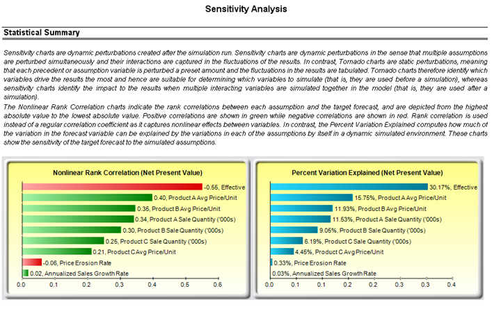
Figure 130.4: Dynamic sensitivity analysis results