The Portfolio Analysis tab (Figure 3.5) returns the computed economic and financial indicators such as NPV, IRR, MIRR, PI, ROI, PP, and DPP for all the Projects combined into a portfolio view. The Economic Results (Level 3) subtabs show the individual Project’s economic and financial indicators, whereas this Level 2 Portfolio Analysis view shows the results of all Projects’ indicators and compares them side by side. There are also two charts available for comparing these individual Projects’ results.
- The Portfolio Analysis tab is used to obtain a side-by-side comparison of all the main economic and financial indicators of all the Projects at once. For instance, you can compare all the NPVs from each Project in a single results grid.
- What appears to be a chart graphic in the upper right (Figure 3.5 shows the DCF module’s default example’s Portfolio Analysis results) is actually a placeholder such that when there are multiple Projects, the data results grid will expand in width to cover said graphic.
- The bubble chart on the left provides a visual representation of three main variables at once (e.g., the y-axis shows the IRR, the x-axis represents the NPV, and the size of the bubble may represent the capital investment; in such a situation, one would prefer a smaller ball that is in the top right quadrant of the chart). As usual, chart icons, Copy Grid, and Copy Chart are available for use in this tab.
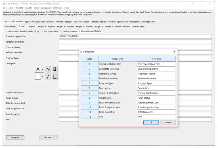
Figure 3.4 – Information and Details
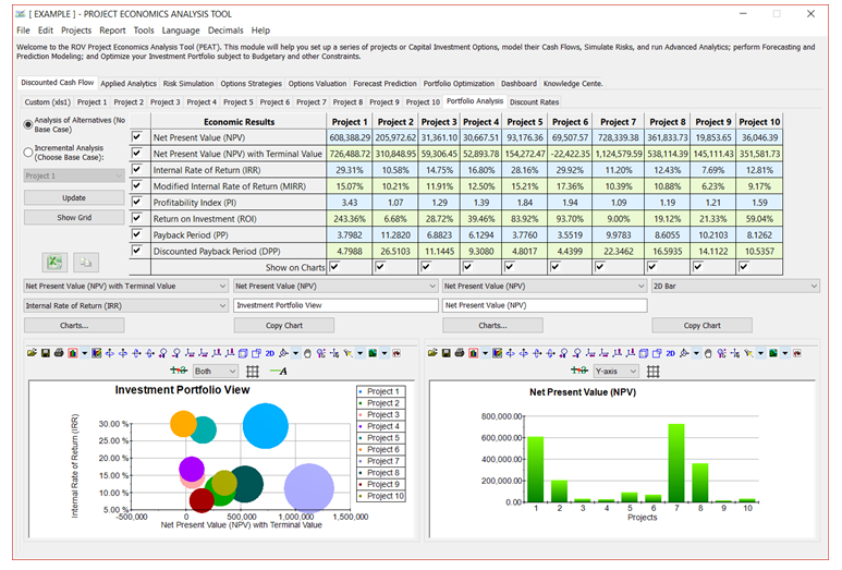
Figure 3.5 – Portfolio Analysis