Theory
Tornado analysis is a powerful analytical tool that captures the static impacts of each variable on the outcome of the model; that is, the tool automatically perturbs each variable in the model a preset amount, captures the fluctuation on the model’s forecast or final result, and lists the resulting perturbations ranked from the most significant to the least. Figures 15.1 through 15.6 illustrate the application of a tornado analysis. For instance, Figure 15.1 is a sample discounted cash flow model where the input assumptions in the model are shown. The question is, what are the critical success drivers that affect the model’s output the most? That is, what really drives the net present value of $96.63, or which input variable impacts this value the most?
To follow along click on Risk Simulator| Example Models | 22 Tornado and Sensitivity Charts (Linear) to access the example model. Figure 15.2 shows this sample model where cell G6, containing the net present value, is chosen as the target result to be analyzed. The target cell’s precedents in the model are used in creating the tornado chart. Precedents are all the input and intermediate variables that affect the outcome of the model. For instance, if the model consists of A = B + C, and where C = D + E, then B, D, and E are the precedents for A (C is not a precedent as it is only an intermediate calculated value). Figure 15.2 also shows the testing range of each precedent variable used to estimate the target result. If the precedent variables are simple inputs, then the testing range will be a simple perturbation based on the range chosen (e.g., the default is ±10%). Each precedent variable can be perturbed at different percentages if required. A wider range is important as it is better able to test extreme values rather than smaller perturbations around the expected values. In certain circumstances, extreme values may have a larger, smaller, or unbalanced impact (e.g., nonlinearities may occur where increasing or decreasing economies of scale and scope creep in for larger or smaller values of a variable) and only a wider range will capture this nonlinear impact.
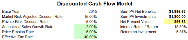
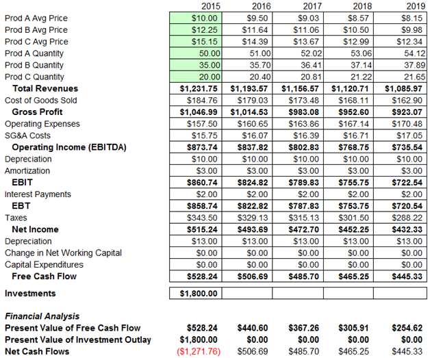
Figure 15.1: A Typical Discounted Cash Flow Analysis
Procedure
Use the following steps to create a tornado analysis:
- Select the single output cell (i.e., a cell with a function or equation) in an Excel model (e.g., cell G6 is selected in our example).
- Select Risk Simulator | Analytical Tools | Tornado Analysis.
- Review the precedents and rename them as appropriate (renaming the precedents to shorter names allows a more visually pleasing tornado and spider chart) and click OK. Alternatively, click on Use Cell Address to apply cell locations as the variable names.
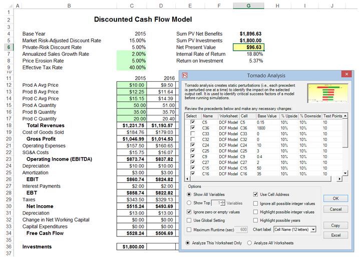
Figure 15.2: Running Tornado Analysis
Tips and Additional Notes on Running a Tornado Analysis
Here are some tips on running tornado analysis and further details on the options available in the tornado analysis user interface (Figure 15.2):
- Tornado analysis should never be run just once. It is meant as a model diagnostic tool, which means that it should ideally be run several times on the same model. For instance, in a large model, a tornado can be run the first time using all of the default settings and all precedents should be shown (select Show All Variables). The result may be a large report and long (and potentially unsightly) tornado chart Nonetheless, this analysis provides a great starting point to determine how many of the precedents are considered critical success factors. For example, the tornado chart may show that the first 5 variables have high impacts on the output, while the remaining 200 variables have little to no impact, in which case, a second tornado analysis is run showing fewer variables (e.g., select the Show Top 10 Variables if the first 5 are critical, thereby creating a satisfactory report and tornado chart that shows a contrast between the key factors and less critical factors. You should never show a tornado chart with only the key variables without showing some less critical variables as a contrast to their effects on the output. Finally, the default testing points can be increased from ±10% of the parameter to some larger value to test for nonlinearities (the spider chart will show nonlinear lines and tornado charts will be skewed to one side if the precedent effects are nonlinear).
- Use Cell Address is always a good idea if your model is large, allowing you to identify the location (worksheet name and cell address) of a precedent cell. If this option is not selected, the software will apply its own fuzzy logic in an attempt to determine the name of each precedent variable (sometimes the names might end up being confusing in a large model with repeated variables or the names might be too long, possibly making the tornado chart unsightly).
- The Analyze This Worksheet and Analyze All Worksheets options allow you to control whether the precedents should only be part of the current worksheet or include all worksheets in the same workbook. This option comes in handy when you are only attempting to analyze an output based on values in the current sheet versus performing a global search of all linked precedents across multiple worksheets in the same workbook.
- Use Global Setting is useful when you have a large model and you wish to test all the precedents at say, ±50% instead of the default 10%. Instead of having to change each precedent’s test values one at a time, you can select this option, change one setting, and click somewhere else in the user interface to change the entire list of the precedents. Deselecting this option will allow you to control the changing of test points one precedent at a time.
- Ignore Zero or Empty Values is an option turned on by default where precedent cells with zero or empty values will not be run in the tornado. This is the typical setting.
- Highlight Possible Integer Values is an option that quickly identifies all possible precedent cells that currently have integer inputs. This function is sometimes important if your model uses switches (e.g., functions such as IF a cell is 1, then something happens, and IF a cell has a 0 value, something else happens, or integers such as 1, 2, 3, and so forth, which you do not wish to test). For instance, ±10% of a flag switch value of 1 will return a test value of 0.9 and 1.1, both of which are irrelevant and incorrect input values in the model, and Excel may interpret the function as an error. This option, when selected, will quickly highlight potential problem areas for tornado You can determine which precedents to turn on or off manually, or you can use the Ignore Possible Integer Values to turn all of them off simultaneously.
- The Excel button creates a live and editable chart in an Excel worksheet.
Results Interpretation
Figure 15.3 shows the resulting tornado analysis report, which indicates that capital investment has the largest impact on net present value (NPV), followed by tax rate, average sale price and quantity demanded of the product lines, and so forth. The report contains four distinct elements:
- In Figure 15.4, we see that by changing one of the inputs, e.g., Investment, by –10%, originally from $1,800 (Base Case Value) now to $1,620 (i.e., the Input Downside), the NPVbase case of $96.63 increases to $276.63 (this is called the Output Downside as NPV is the output, and this result is when the input is changed to its lower value or –10% downside). Conversely, when Investment goes up +10% from $1,800 (Base Case Value) to $1,980 (i.e., the Input Upside), the NPV goes down to –$83.37 (this is called the Output Upside as NPV is the output, and this result occurs when the input is changed to its upper value or +10% upside). Clearly, this is a negative relationship (higher investment means lower NPV, and vice versa). The total net swing from –$83.37 to $276.63 is $360.00, which is termed the Effective Range. Then, the investment amount is changed back to its original value of $1,800 prior to proceeding onto the next input variable. In Figure 15.4, the next input tested was Tax Rate. In other words, one variable is tested at a time by perturbing a preset amount. Finally, the results in Figure 15.4 are generated by sorting the precedent variables using the Effective Range from highest to lowest. Finally, you can see that Investment and Tax Rate are negatively related to NPV, whereas Prices and Quantities of products A, B, C are positively related to NPV (i.e., the higher the price or quantity sold, the higher the project’s NPV).
- The spider chart (Figure 15.5) illustrates these effects graphically. The y-axis is the NPV target value while the x-axis depicts the percentage change on each of the precedent values (the central point is the base case value at $96.63 at 0% change from the base value of each precedent). Positively sloped lines indicate a positive relationship or effect while negatively sloped lines indicate a negative relationship (e.g., investment is negatively sloped, which means that the higher the investment level, the lower the NPV). The absolute value of the slope indicates the magnitude of the effect computed as the percentage change in the result given a percentage change in the precedent (a steep line indicates a higher impact on the NPV y-axis given a change in the precedent x-axis).
- Figure 15.6’s tornado chart plots the results in Figure 15.4’s sensitivity table. As previously explained, Investment has the largest impact on NPV and has an inverse relationship with NPV. Therefore, in the tornado chart, the first horizontal bar is Investment (each bar represents a precedent variable––see the precedent variable names on the y-axis), and the values $1,980 and $1,620 at the end of the bars represent the input’s upside and downside values. The x-axis is the output variable (NPV). Therefore, we can see that Investment is negatively related to NPV (the bar’s right side has a lower input value whereas the x-axis on the right side represents a higher NPV). In Risk Simulator, the chart is in color and we can see that the right side of this Investment bar is red (lower end of the input) and green on the left side of the bar (upper end of the input). As an additional explanation, the opposite is true for Price of Product A (third bar in the chart), where $11 (input upside) is on the right (the Risk Simulator report’s chart will show the right part of the bar in green), indicating a higher NPV, and hence, a positive relationship between Price of Product A (input) and NPV (output). The left side of this bar would be red (input downside at $9), and on the left where NPV is a lower value. To recap, green bars on the right indicate that the precedent variable is positively related to the output, and red bars on the right indicate a negative relationship between the precedent input and resulting output variables.
Notes
Remember that tornado analysis is a static sensitivity analysis applied on each input variable in the model—that is, each variable is perturbed individually and the resulting effects are tabulated. This makes tornado analysis a key component to execute before running a simulation. One of the very first steps in risk analysis is where the most important impact drivers in the model are captured and identified. The next step is to identify which of these important impact drivers are uncertain. These uncertain impact drivers are the critical success drivers of a project, where the results of the model depend on these critical success drivers. These variables are the ones that should be simulated. Do not waste time simulating variables that are neither uncertain nor have little impact on the results. Tornado charts assist in identifying these critical success drivers quickly and easily. Following this example, it might be that price and quantity should be simulated, assuming that the required investment and effective tax rate are both known in advance and unchanging.
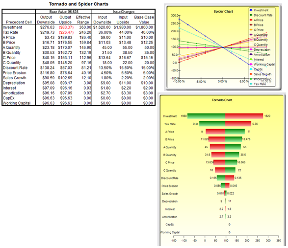
Figure 15.3: Tornado Analysis Report
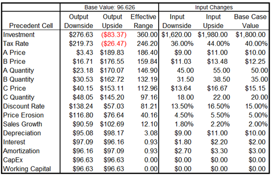
Figure 15.4: Sensitivity Table
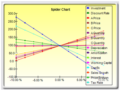
Figure 15.5: Spider Chart
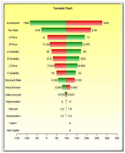
Figure 15.6: Tornado Chart
Although the tornado chart is easier to read, the spider chart is important to determine if there are any nonlinearities in the model. For instance, Figure 15.7 shows another spider chart where nonlinearities are fairly evident (the lines on the graph are not straight but curved). The example model used is Risk Simulator | Example Models | 22 Tornado and Sensitivity Charts (Nonlinear), which applies the Black–Scholes option pricing model. Such nonlinearities cannot be ascertained from a tornado chart as readily, and may be important information in the model or provide decision makers important insight into the model’s dynamics. For instance, in this Black–Scholes model, the fact that stock price and strike price are nonlinearly related to the option value is important to know. This characteristic implies that option value will not increase or decrease proportionally to the changes in stock or strike price, and that there might be some interactions between these two prices as well as other variables. As another example, an engineering model depicting nonlinearities might indicate that a particular part or component, when subjected to a high enough force or tension, will break. Clearly, it is important to understand such nonlinearities.
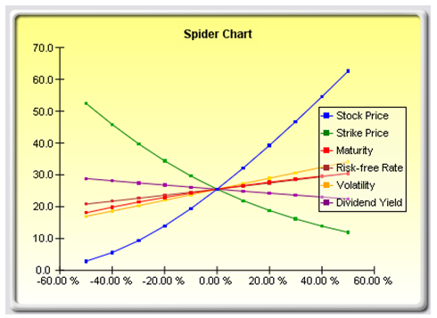
Figure 15.7: Nonlinear Spider Chart