This section deals with using regression analysis for forecasting purposes. It is assumed that the reader is sufficiently knowledgeable about the fundamentals of regression analysis. Instead of focusing on the detailed theoretical mechanics of the regression equation, we instead look at the basics of applying regression analysis and work through the various relationships that a regression analysis can capture, as well as the common pitfalls in regression, including the problems of outliers, nonlinearities, heteroskedasticity, autocorrelation, and structural breaks.
The general bivariate linear regression equation takes the form of![]() where β0 is the intercept, β1 is the slope, and ε is the error term. It is bivariate as there are only two variables, a Y or dependent variable and an X or independent variable, where X is also known as the regressor (sometimes a bivariate regression is also known as a univariate regression as there is only a single independent variable X). The dependent variable is named as such as it depends on the independent variable; for example, sales revenue depends on the amount of marketing costs expended on a product’s advertising and promotion, making the dependent variable sales and the independent variable marketing costs. An example of a bivariate regression is seen as simply inserting the best-fitting line through a set of data points in a two-dimensional plane as seen on the left panel in Figure 12.22. In other cases, a multivariate regression can be performed, where there are multiple or n number of independent X variables, where the general regression equation will now take the form of
where β0 is the intercept, β1 is the slope, and ε is the error term. It is bivariate as there are only two variables, a Y or dependent variable and an X or independent variable, where X is also known as the regressor (sometimes a bivariate regression is also known as a univariate regression as there is only a single independent variable X). The dependent variable is named as such as it depends on the independent variable; for example, sales revenue depends on the amount of marketing costs expended on a product’s advertising and promotion, making the dependent variable sales and the independent variable marketing costs. An example of a bivariate regression is seen as simply inserting the best-fitting line through a set of data points in a two-dimensional plane as seen on the left panel in Figure 12.22. In other cases, a multivariate regression can be performed, where there are multiple or n number of independent X variables, where the general regression equation will now take the form of![]() In this case, the best-fitting line will be within an n + 1 dimensional plane.
In this case, the best-fitting line will be within an n + 1 dimensional plane.
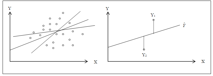
Figure 12.22: Bivariate Regression
However, fitting a line through a set of data points in a scatter plot as in Figure 12.22 may result in numerous possible lines. The best-fitting line is defined as the single unique line that minimizes the total vertical errors, that is, the sum of the absolute distances between the actual data points (Yi) and the estimated line ![]() as shown on the right panel of Figure 12.22. In order to find the best fitting line that minimizes the errors, a more sophisticated approach is required, that is, regression analysis. Regression analysis, therefore, finds the unique best-fitting line by requiring that the total errors be minimized, or by calculating
as shown on the right panel of Figure 12.22. In order to find the best fitting line that minimizes the errors, a more sophisticated approach is required, that is, regression analysis. Regression analysis, therefore, finds the unique best-fitting line by requiring that the total errors be minimized, or by calculating
where only one unique line minimizes this sum of squared errors. The errors (vertical distance between the actual data and the predicted line) are squared to avoid the negative errors from canceling out the positive errors. Solving this minimization problem with respect to the slope and intercept requires calculating the first derivative and setting them equal to zero:
which yields the Least Squares Regression Equations seen in Figure 12.23.
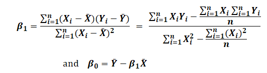
Figure 12.23: Least Squares Regression Equations
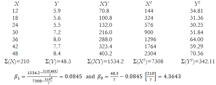
Example: Given the following sales amounts ($ millions) and advertising sizes (measured as linear inches by summing up all the sides of an ad) for a local newspaper, answer the following questions.
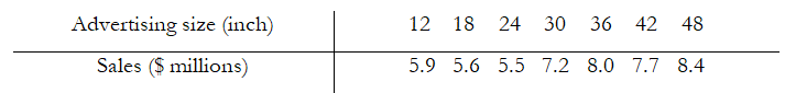
- Which is the dependent variable and which is the independent variable?
The independent variable is advertising size, whereas the dependent variable is sales. - Manually calculate the slope (β1) and the intercept (β0) terms.
- What is the estimated regression equation?
Y = 4.3643 + 0.0845X or Sales = 4.3643 + 0.0845(Size) - What would the level of sales be if we purchase a 28-inch ad?
Y = 4.3643 + 0.0845 (28) = $6.73 million dollars in sales
Note that we only predict or forecast and cannot say for certain. This is only an expected value or on average.
Regression Output
Using the data in the previous example, a regression analysis can be performed using either Excel’s Data Analysis add-in or Risk Simulator software. Figure 12.24 shows Excel’s regression analysis output. Notice that the coefficients on the intercept and X variable confirm the results we obtained in the manual calculation.
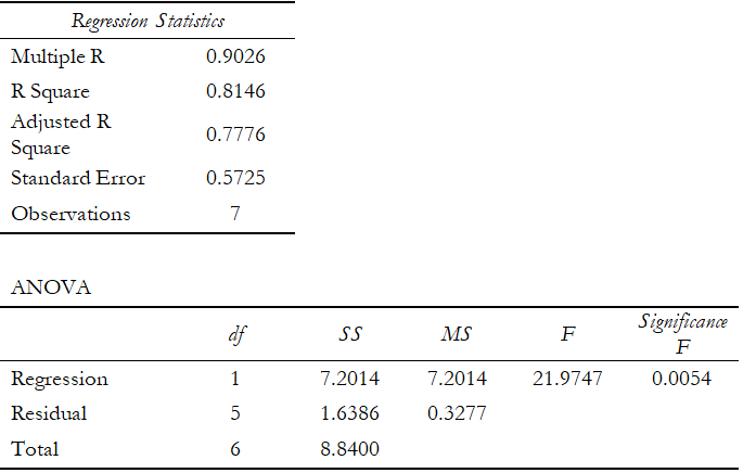
Figure 12.24: Regression Output from Excel’s Data Analysis Add-In
The same regression analysis can be performed using Risk Simulator. The results obtained through Risk Simulator are seen in Figure 12.25. Notice again the identical answers to the slope and intercept calculations. Clearly, there are significant amounts of additional information obtained through the Excel and Risk Simulator analyses. Most of these additional statistical outputs pertain to goodness-of-fit measures, that is, a measure of how accurate and statistically reliable the model is.
Figure 12.25: Regression Output from Risk Simulator Software
Goodness-of-Fit
Goodness-of-fit statistics provide a glimpse into the accuracy and reliability of the estimated regression model. They usually take the form of a t-statistic, F-statistic, R-squared statistic, adjusted R-squared statistic, Durbin–Watson statistic, and their respective probabilities. (See the t-statistic, F-statistic, and critical Durbin–Watson tables at the end of this book for the corresponding critical values used later in this chapter). The following sections discuss some of the more common regression statistics and their interpretation.
The R-squared (R2), or the coefficient of determination, is an error measurement that looks at the percent variation of the dependent variable that can be explained by the variation in the independent variable for regression analysis. The coefficient of determination can be calculated by:
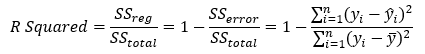
where the coefficient of determination is one less the ratio of the sums of squares of the errors (SSE) to the total sums of squares (TSS). In other words, the ratio of SSE to TSS is the unexplained portion of the analysis, thus, one less the ratio of SSE to TSS is the explained portion of the regression analysis.
Figure 12.26 provides a graphical explanation of the coefficient of determination. The estimated regression line is characterized by a series of predicted values ![]() the average value of the dependent variable’s data points is denoted
the average value of the dependent variable’s data points is denoted ![]() and the individual data points are characterized by Yi. Therefore, the total sum of squares, that is, the total variation in the data or the total variation about the average dependent value, is the total of the difference between the individual dependent values and its average (seen as the total squared distance of
and the individual data points are characterized by Yi. Therefore, the total sum of squares, that is, the total variation in the data or the total variation about the average dependent value, is the total of the difference between the individual dependent values and its average (seen as the total squared distance of ![]() in Figure 12.26). The explained sum of squares, the portion that is captured by the regression analysis, is the total difference between the regression’s predicted value and the average dependent variable’s dataset (seen as the total squared distance of
in Figure 12.26). The explained sum of squares, the portion that is captured by the regression analysis, is the total difference between the regression’s predicted value and the average dependent variable’s dataset (seen as the total squared distance of![]() in Figure 12.26). The difference between the total variation (TSS) and the explained variation (ESS) is the unexplained sums of squares, also known as the sums of squares of the errors (SSE).
in Figure 12.26). The difference between the total variation (TSS) and the explained variation (ESS) is the unexplained sums of squares, also known as the sums of squares of the errors (SSE).
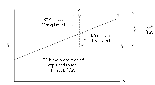
Figure 12.26: Explaining the Coefficient of Determination
Another related statistic, the adjusted coefficient of determination, or the adjusted R-squared ![]() corrects for the number of independent variables (k) in a multivariate regression through a degrees of freedom correction to provide a more conservative estimate:
corrects for the number of independent variables (k) in a multivariate regression through a degrees of freedom correction to provide a more conservative estimate:
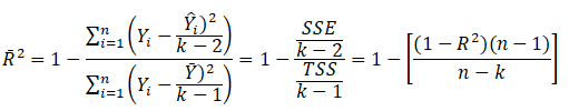
The adjusted R-squared should be used instead of the regular R-squared in multivariate regressions because every time an independent variable is added into the regression analysis, the R-squared will increase; indicating that the percent variation explained has increased. This increase occurs even when nonsensical regressors are added. The adjusted R-squared takes the added regressors into account and penalizes the regression accordingly, providing a much better estimate of a regression model’s goodness-of-fit.
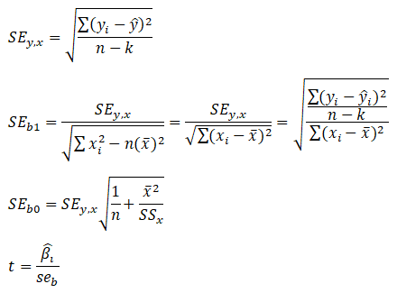
Next, the standard error of the regression ![]() and the standard errors of the intercept
and the standard errors of the intercept![]() and slope
and slope ![]() are needed to compute the significant t-statistics for the regression coefficients:
are needed to compute the significant t-statistics for the regression coefficients:
Other goodness-of-fit statistics include the t-statistic and the F-statistic (Figure 12.27). The former is used to test if each of the estimated slope and intercept(s) is statistically significant, that is, if it is statistically significantly different from zero (therefore making sure that the intercept and slope estimates are statistically valid). The latter applies the same concepts but simultaneously for the entire regression equation including the intercept and slope(s). Using the previous example, the following illustrates how the t-statistic and F-statistic can be used in a regression analysis. (See the t-statistic and F-statistic tables at the end of the book for their corresponding critical values). It is assumed that the reader is somewhat familiar with hypothesis testing and tests of significance in basic statistics.
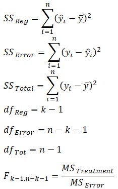
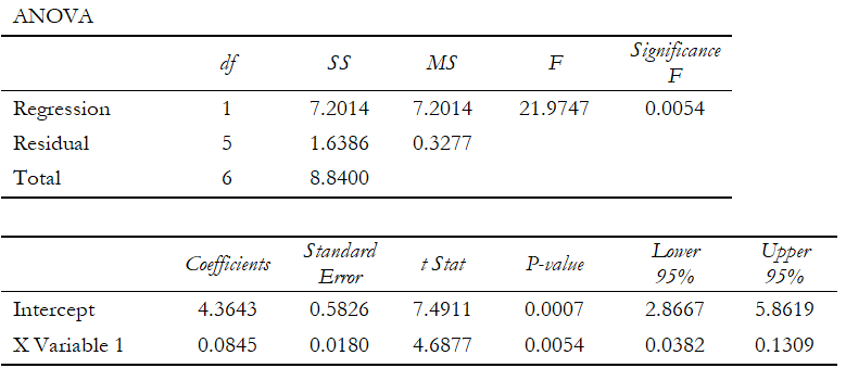
Figure 12.27: ANOVA and Goodness-of-Fit Table
Example: Given the information from the regression analysis output in Figure 12.27, interpret the following:
(a) Perform a hypothesis test on the slope and intercept to see if they are each significant at a two-tailed alpha (α) of 0.05).
The null hypothesis H0 is such that the slope β1 = 0 and the alternate hypothesis Ha is such that β1 ≠ 0. The t-statistic calculated is 4.6877, which exceeds the t-critical (2.9687 obtained from the t-statistic table at the end of this book) for a two-tailed alpha of 0.05 and degrees of freedom n – k = 7 – 1 = 6. Therefore, the null hypothesis is rejected, and one can state that the slope is statistically significantly different from 0, indicating that the regression’s estimate of the slope is statistically significant. This hypothesis test can also be performed by looking at the t-statistic’s corresponding p-value (0.0054), which is less than the alpha of 0.05, which means the null hypothesis is rejected. The hypothesis test is then applied to the intercept, where the null hypothesis H0 is such that the intercept β0 = 0 and the alternate hypothesis Ha is such that β0 ≠ 0. The t-statistic calculated is 7.4911, which exceeds the critical t value of 2.9687 for n – k (7 – 1 = 6) degrees of freedom, so, the null hypothesis is rejected indicating that the intercept is statistically significantly different from 0, meaning that the regression’s estimate of the intercept if statistically significant. The calculated p-value (0.0007) is also less than the alpha level, which means the null hypothesis is also rejected.
(b) Perform a hypothesis test to see if both the slope and intercept are significant as a whole. In other words, if the estimated model is statistically significant at an alpha (α) of 0.05.
The simultaneous null hypothesis H0 is such that β0 = β1 = 0 and the alternate hypothesis Ha is β0 ≠ β1 ≠ 0. The calculated F-value is 21.9747, which exceeds the critical F-value (5.99 obtained from the table at the end of this book) for k (1) degrees of freedom in the numerator and n – k (7 – 1 = 6) degrees of freedom for the denominator, so the null hypothesis is rejected indicating that both the slope and intercept are simultaneously significantly different from 0 and that the model as a whole is statistically significant. This result is confirmed by the p-value of 0.0054 (significance of F), which is less than the alpha value, thereby rejecting the null hypothesis and confirming that the regression as a whole is statistically significant.
(c) Using Risk Simulator’s regression output in Figure 12.28, interpret the R2 value. How is it related to the correlation coefficient?
The calculated R2 is 0.8146, meaning that 81.46% of the variation in the dependent variable can be explained by the variation in the independent variable. The R2 is simply the square of the correlation coefficient, that is, the correlation coefficient between the independent and dependent variable is 0.9026.
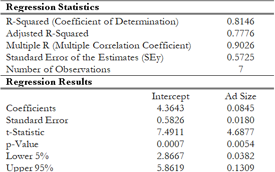
Figure 12.28: Additional Regression Output from Risk Simulator
Manual Regression Calculations
A manual computation example is now in order. To truly understand and peel back the mystique of regression analysis, it is important to see how the math works. Figure 12.29 illustrates an example dataset and its corresponding bivariate regression results in BizStats. Using the BizStats results, we can see how the manual calculations proceed in Figure 12.30. Finally, Figure 12.31 shows how the intercept and slope coefficients can be computed using matrix math. The use of matrix math falls outside the purview of this book, but, briefly, the ordinary least squares (OLS) coefficients can be computed using:![]() (see derivations on the following page). For regressions with an intercept coefficient, the X matrix requires a column of identities (the value of 1 is repeated for every row) prior to the x values (see columns AD and AE in Figure 12.31). This approach can be implemented in Excel using the following formula:
(see derivations on the following page). For regressions with an intercept coefficient, the X matrix requires a column of identities (the value of 1 is repeated for every row) prior to the x values (see columns AD and AE in Figure 12.31). This approach can be implemented in Excel using the following formula:
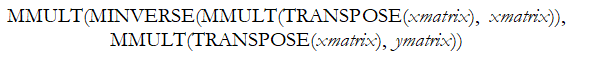
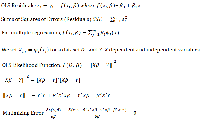
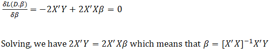
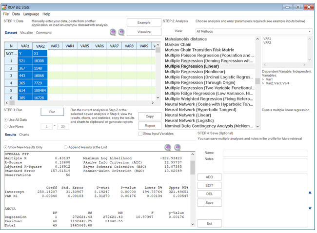
Figure 12.29: Bivariate Regression in BizStats
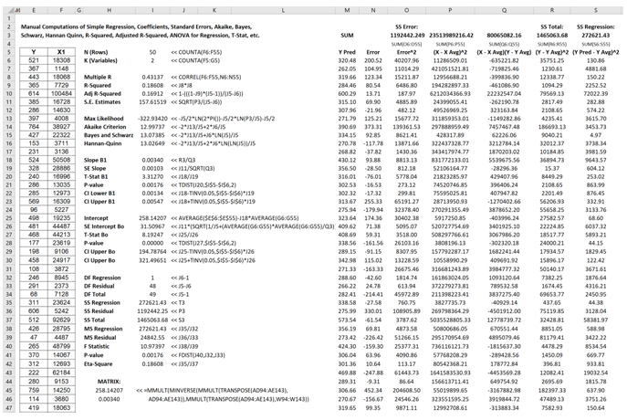
Figure 12.30: Bivariate Regression Manual Computations
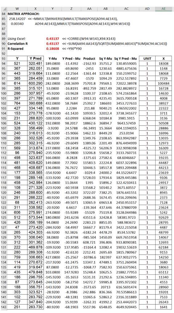
Figure 12.31: Regression Using Matrix Math
Regression Assumptions
The following six assumptions are the requirements for a regression analysis to work:
- The relationship between the dependent and independent variables is linear.
- The expected value of the errors or residuals is zero.
- The errors are independently and normally distributed.
- The variance of the errors is constant or homoskedastic and not varying over time.
- The errors are independent and uncorrelated with the explanatory variables.
- The independent variables are uncorrelated to each other meaning that no multicollinearity exists.
One very simple method to verify some of these assumptions is to use a scatter plot. This approach is simple to use in a bivariate regression scenario. If the assumption of the linear model is valid, the plot of the observed dependent variable values against the independent variable values should suggest a linear band across the graph with no obvious departures from linearity. Outliers may appear as anomalous points in the graph, often in the upper right-hand or lower left-hand corner of the graph. However, a point may be an outlier in either an independent or dependent variable without necessarily being far from the general trend of the data.
If the linear model is not correct, the shape of the general trend of the X-Y plot may suggest the appropriate function to fit (e.g., a polynomial, exponential, or logistic function). Alternatively, the plot may suggest a reasonable transformation to apply. For example, if the X-Y plot arcs from lower left to upper right so that data points either very low or very high in the independent variable lie below the straight line suggested by the data, while the middle data points of the independent variable lie on or above that straight line, taking square roots or logarithms of the independent variable values may promote linearity.
If the assumption of equal variances or homoskedasticity for the dependent variable is correct, the plot of the observed dependent variable values against the independent variable should suggest a band across the graph with roughly equal vertical width for all values of the independent variable. That is, the shape of the graph should suggest a tilted cigar and not a wedge or a megaphone.
A fan pattern like the profile of a megaphone, with a noticeable flare either to the right or to the left in the scatter plot, suggests that the variance in the values increases in the direction where the fan pattern widens (usually as the sample mean increases), and this, in turn, suggests that a transformation of the dependent variable values may be needed.
As an example, Figure 12.32 shows a scatter plot of two variables: sales revenue (dependent variable) and marketing costs (independent variable). Clearly, there is a positive relationship between the two variables, as is evident from the regression results in Figure 12.33, where the slope of the regression equation is a positive value (0.7447). The relationship is also statistically significant at 0.05 alpha and the coefficient of determination is 0.43, indicating a somewhat weak but statistically significant relationship.
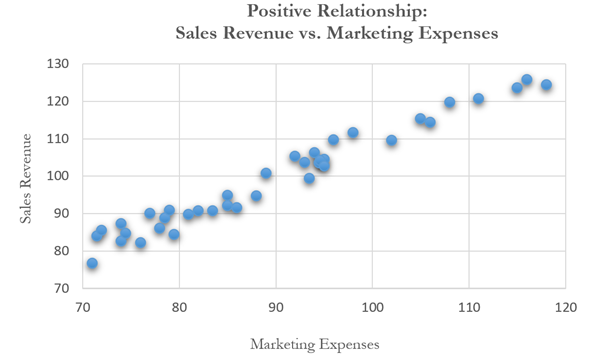
Figure 12.32: Scatter Plot Showing a Positive Relationship
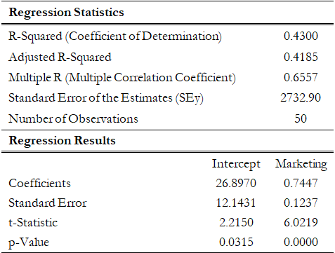
Figure 12.33: Bivariate Regression Results for Positive Relationship
Compare that to a multiple linear regression in Figure 12.34, where another independent variable, the pricing structure of the product, is added. The regression’s adjusted coefficient of determination (adjusted R-squared) is now 0.62, indicating a much stronger regression model. The pricing variable shows a negative relationship to the sales revenue, a very much expected result, as according to the law of demand in economics, a higher price point necessitates a lower quantity demanded, hence lower sales revenues. The t-statistics and corresponding probabilities (p-values) also indicate a statistically significant relationship.
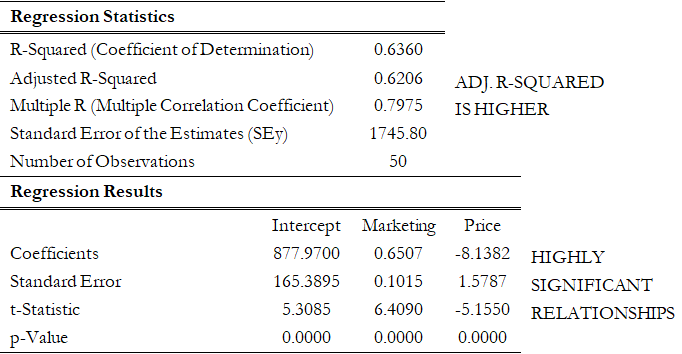
Figure 12.34: Multiple Linear Regression Results for Positive and Negative Relationships
In contrast, Figure 12.35 shows a scatter plot of two variables with little to no relationship, which is confirmed by the regression result in Figure 12.36, where the coefficient of determination is 0.066, close to being negligible. In addition, the calculated t-statistic and corresponding probability indicate that the marketing-expenses variable is statistically insignificant at the 0.05 alpha level meaning that the regression equation is not significant (a fact that is also confirmed by the low F-statistic).
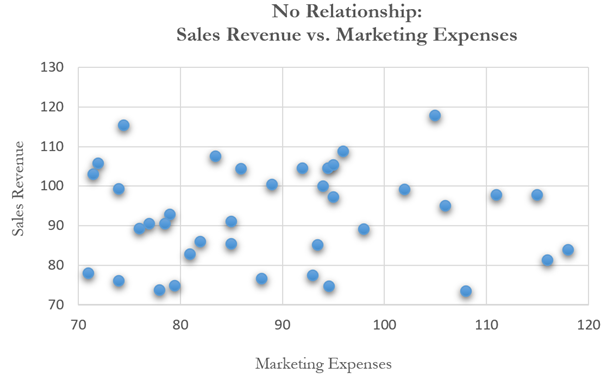
Figure 12.35: Scatter Plot Showing No Relationship
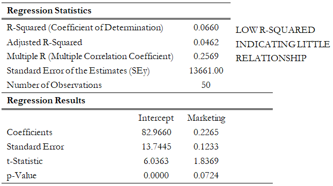
Figure 12.36: Multiple Regression Results Showing No Relationship