In the Risk Dashboard section, multiple customized chart views complete with reports, data grids, charts, and visuals based on specific G.O.P.A.D. category, Division, Risk Category, or Risk Dates can be created. The Risk Dashboard is used to slice and dice the Risk Register elements into various drill-down views. Following are descriptions of some dashboards. Note that the dashboard will show results of the active Risk Register only. To activate a Risk Register, go back to the Risk Register section and double-click on a saved Risk Register. Make sure it has Risk Element data in the data grid, so that the dashboard will be able to show the results.
Risk Dashboard – Risk Elements
In the Risk Elements section, KRI scores can be viewed across different selected segments, divisions, or G.O.P.A.D. category of the organization over a specified time span, as shown in Figure 2.6. Simply select or change the relevant settings such as whether to Show All Risks or risks within a specified Risk Category, G.O.P.A.D., Division, or Risk Manager. Then, either show all dates or specify a date range as well as only active risks or all risks, both active and inactive, need to be included. The Risk Elements View allows users to see the color-coded KRI for each risk element and a pie chart showcasing the percentage allocation of each KRI color code. The Pareto Chart View shows the same results using a Pareto chart where the KRIs are ranked from the highest to the lowest and the cumulative contributions to variance are computed (e.g., we can determine that the top 5 risk elements contribute to 80% of the risk portfolio).
Risk Dashboard – Risk Heat Maps
The Risk Maps section shows KRI counts with relevant customizable risk-based color codes across various risk categories, divisions, and segments over specified time periods (Figure 2.7). Each value in the matrix’s cells represents the total number of Risk Elements falling within that specific cross-section of Likelihood and Impact levels. The color settings (green to red), number of color categories (3 colors or 5 colors), and the granularity of the risk matrix (5 × 5 or 10 × 10) are based on the inputs in the Risk Settings tab. The axis labels are also customizable in the Risk Settings tab (Risk Likelihood, Risk Impact, and the category labels).
Risk Dashboard – Risk Groups
The Risk Groups section shows the risk accumulation by G.O.P.A.D. category or other risk groups can be shown as bar charts indicating the Risk Element counts within these selected groups (Figure 2.8). The ability to slice and dice the data to generate customized reports comes from the previously set up various G.O.P.A.D. components and their mapped relationships to risk types and risk categories. In the example shown in Figure 2.8, the x-axis shows the 5 risk levels aggregated by Risk Groups. The y-axis of the bar charts can be set as the total KRI for each Risk Group or by Risk Element counts.
Risk Dashboard – Risk Exposure
The Risk Exposure section shows the results of the selected segment as risk dials and charts and is compared against the entire Company (Figure 2.9). These dials and charts represent the Diversifiable and Undiversifiable Risk Exposure for the selected category and time period by summing all the relevant Risk Elements’ dollar or monetary exposures in the active Risk Register. The default terms of Diversifiable and Undiversifiable Residual Risk can all be user-defined in the Risk Settings tab as described previously.
Risk Dashboard – Risk Taxonomy
This report provides a top-down (drill-down) visual representation of the structure of the corporation and its risk associations or Risk Taxonomy, as well as a bottom-up view of how a specific risk permeates throughout the corporation (Figure 2.10).
Risk Dashboard – Risk Inventory
Customized risk profiles and risk reports by Division, G.O.P.A.D. category, Risk Category, Risk Dates, and so forth can be easily set up to query the active Risk Register for all the relevant Risk Elements that fall within the search parameters and return a Risk Inventory of all the risks identified (Figure 2.11). This report allows for the Risk Monitoring of project management, tasks, completion, and assignments. It also provides for Risk Governance; provides a Risk Effectiveness Summary, Risk Audit Trail, and Compliance; and complies with International Standards Organization (ISO) Standards.
See Chapter 3 on how PEAT and ROV technology is in compliance with multiple global risk standards such as COSO, BASEL III/IV, NIST, ISO 31000:2009, and others.
Risk Dashboard – Risk Probability
This Risk Probability section provides users the ability to compute the probability density function (PDF) and cumulative distribution function (CDF) of a discrete risk event occurring or continuous risk amounts using historical experience. The analysis is similar to that in Risk Simulator’s Distributional Analysis tool, where after a probability distribution is selected and its required input parameters are entered, the PDF and CDF values are returned as a probability table.
Figure 2.12 shows an example situation where a discrete Poisson distribution is selected and the Lambda (mean) value entered is 1.5 (e.g., data was collected for 3 months on the number of errors in bank check deposits per work week at a specific branch of a national bank, and the data shows that there are, on average, 1.5 errors per work week). By setting some starting and ending range and step size, the computed table shows the PDF probability and CDF cumulative probability of a specific risk category’s number of events per work week (check deposit errors). The probability that within any work week there will be no check deposit errors is 22.31%, exactly one error is 33.47%, exactly two errors is 25.10%, and so forth. Cumulatively, we can also state that we are 93.44% sure that within any work week, there will be three or fewer risk event errors of the same risk category, assuming history is the best indicator of future performance.
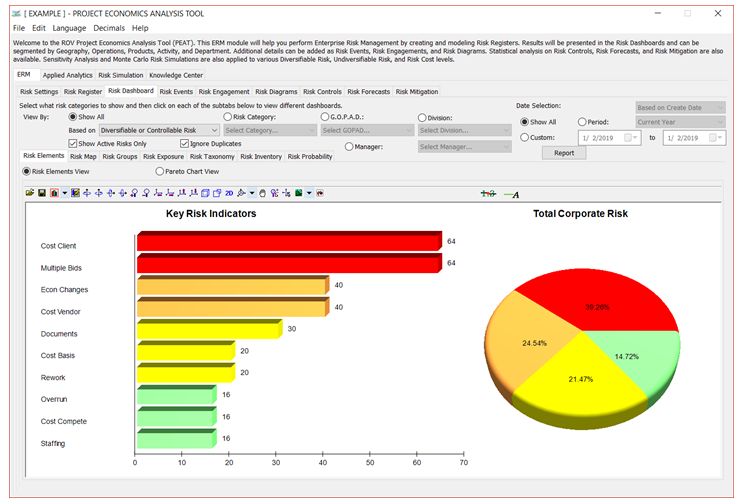
Figure 2.6: Risk Dashboard’s Risk Elements
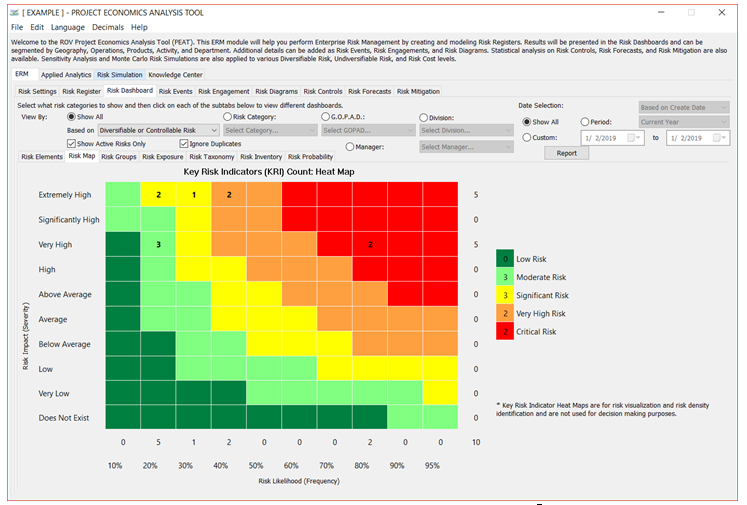
Figure 2.7: Risk Dashboard’s Risk Heat Map
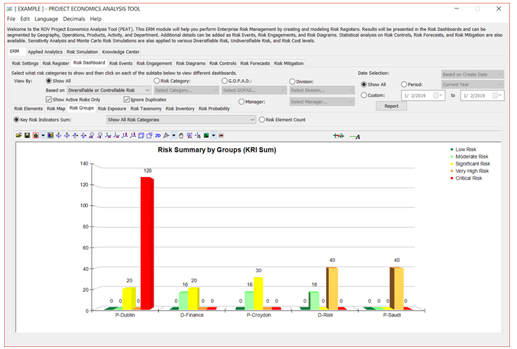
Figure 2.8: Risk Dashboard’s Risk Groups (Element Count by Division)
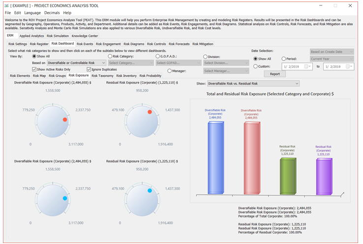
Figure 2.9: Risk Dashboard’s Risk Exposure Levels (by G.O.P.A.D. and Corporate)
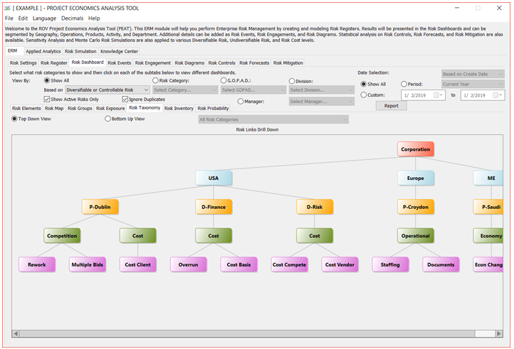
Figure 2.10: Risk Dashboard’s Risk Taxonomy (Top-Down View)
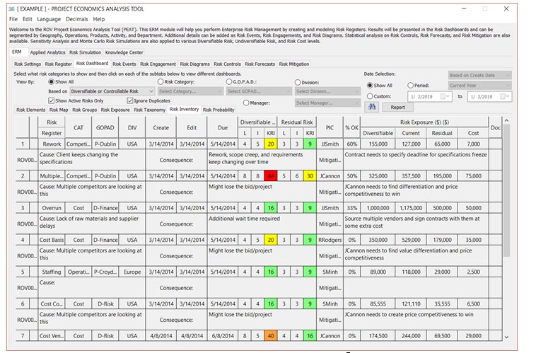
Figure 2.11: Risk Dashboard’s Risk Inventory
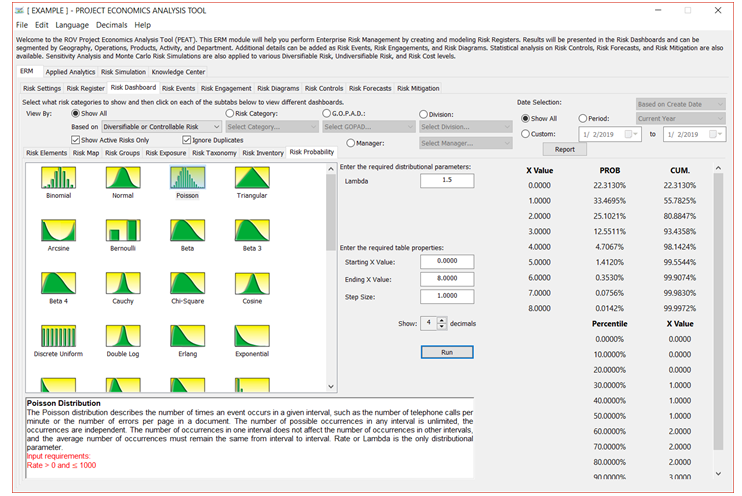
Figure 2.12: Risk Dashboard’s Exact Probability Analysis (CDF and PDF)