Theory
A related feature is sensitivity analysis. While tornado analysis (tornado charts and spider charts) applies static perturbations before a simulation run, sensitivity analysis applies dynamic perturbations created after the simulation run. Tornado and spider charts are the results of static perturbations, meaning that each precedent or assumption variable is perturbed a preset amount one at a time, and the fluctuations in the results are tabulated. In contrast, sensitivity charts are the results of dynamic perturbations in the sense that multiple assumptions are perturbed simultaneously and their interactions in the model and correlations among variables are captured in the fluctuations of the results. Tornado charts, therefore, identify which variables drive the results the most and hence are suitable for simulation, whereas sensitivity charts identify the impact on the results when multiple interacting variables are simulated together in the model. This effect is clearly illustrated in Figure 15.8. Notice that the ranking of critical success drivers is similar to the tornado chart in the previous examples. However, if correlations are added between the assumptions, Figure 15.9 shows a very different picture. Notice, for instance, price erosion had little impact on NPV but when some of the input assumptions are correlated, the interaction that exists between these correlated variables makes price erosion have more impact. Note that tornado analysis cannot capture these correlated dynamic relationships. Only after a simulation is run will such relationships become evident in a sensitivity analysis. A tornado chart’s pre-simulation critical success factors will therefore sometimes be different from a sensitivity chart’s post-simulation critical success factor. The post-simulation critical success factors should be the ones that are of interest as these more readily capture the model precedents’ interactions.
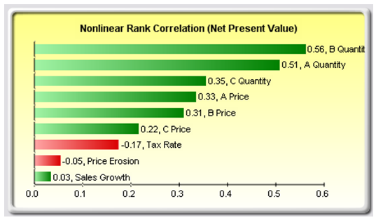
Figure 15.8: Sensitivity Chart Without Correlations
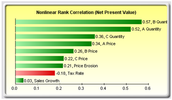
Figure 15.9: Sensitivity Chart With Correlations
Procedure
Use the following steps to create a sensitivity analysis:
- Open or create a model, define assumptions C and forecasts, and run the simulation––the example here uses the Risk Simulator | Example Models | 22 Tornado and Sensitivity Charts (Linear) file.
- Select Risk Simulator | Analytical Tools | Sensitivity Analysis.
- Select the forecast of choice to analyze and click OK (Figure 15.10).
Note that sensitivity analysis cannot be run unless assumptions and forecasts have been defined and a simulation has been run.
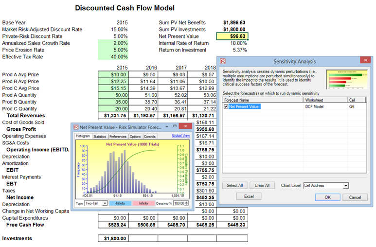
Figure 15.10: Running Sensitivity Analysis
Results Interpretation
The results of the sensitivity analysis comprise a report and two key charts. The first is a nonlinear rank correlation chart (Figure 15.11) that ranks from highest to lowest the assumption-forecast correlation pairs. These correlations are nonlinear and nonparametric, making them free of any distributional requirements (i.e., an assumption with a Weibull distribution can be compared to another with a beta distribution). The results from this chart are fairly similar to that of the tornado analysis seen previously (of course, without the capital investment value, which we decided was a known value and hence was not simulated), with one special exception. Tax rate was relegated to a much lower position in the sensitivity analysis chart (Figure 15.11) as compared to the tornado chart (Figure 15.6). This is because, by itself, tax rate will have a significant impact but once the other variables are interacting in the model, it appears that tax rate has less of a dominant effect (this is because tax rate has a smaller distribution as historical tax rates tend not to fluctuate too much, and also because tax rate is a straight percentage value of the income before taxes, where other precedent variables have a larger effect on NPV). This example proves that performing sensitivity analysis after a simulation run is important to ascertain if there are any interactions in the model and if the effects of certain variables still hold. The second chart (Figure 15.12) illustrates the percent variation explained; that is, of the fluctuations in the forecast, how much of the variation can be explained by each of the assumptions after accounting for all the interactions among variables? Notice that the sum of all variations explained is usually close to 100% (sometimes other elements impact the model but they cannot be captured here directly), and if correlations exist, the sum may sometimes exceed 100% (due to the interaction effects that are cumulative). Briefly, think of Figure 15.11 as nonlinear rank correlations (R) of each simulation input assumption to the output forecast, where each bar is a simulation input assumption. And Figure 15.12 as the R-square or coefficient of determination (0%–100%) showing the percent variation explained by each input simulation assumption on the output forecast variable.
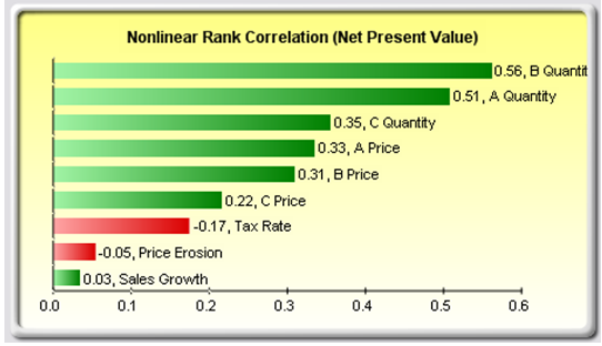
Figure 15.11: Rank Correlation Chart
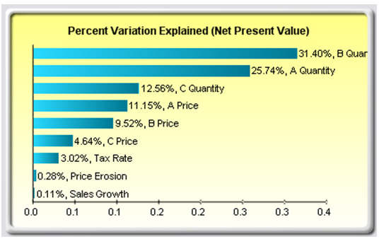
Figure 15.12: Contribution to Variance Chart
Notes
Tornado analysis is performed before a simulation run while sensitivity analysis is performed after a simulation run. Spider charts in tornado analysis can consider nonlinearities while rank correlation charts in sensitivity analysis can account for nonlinear and distributional-free conditions.