A Pareto chart contains both a bar chart and a line graph. Individual values are represented in descending order by the bars, and the cumulative total is represented by the ascending line as shown in Figure TN.22. The following sample dataset is used to generate the chart:
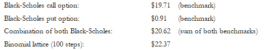
As can be seen in Figure TN.22, the variables are listed from high to low, and the cumulative percentage (%) is computed. The cumulative percentage goes to 100% and is shown on the right vertical axis, whereas the values are shown on the left vertical axis.
The Pareto chart is also known as the “80-20” chart, whereby you see that by focusing on the top three variables, we are already accounting for more than 80% of the cumulative effects of the total.
COMPARING PARETO WITH SENSITIVITY
A related feature is sensitivity analysis. While tornado analysis (tornado charts and spider charts) applies static perturbations before a simulation run, sensitivity analysis applies dynamic perturbations created after the simulation run. Tornado and spider charts are the results of static perturbations, meaning that each precedent or assumption variable is perturbed a preset amount one at a time, and the fluctuations in the results are tabulated. In contrast, sensitivity charts are the results of dynamic perturbations in the sense that multiple assumptions are perturbed simultaneously and their interactions in the model and correlations among variables are captured in the fluctuations of the results. Tornado charts, therefore, identify which variables drive the results the most and, hence, are suitable for simulation, whereas sensitivity charts identify the impact on the results when multiple interacting variables are simulated together in the model. This effect is clearly illustrated in Figure TN.23. Notice that the rankings of critical success drivers are similar to the Pareto chart in the previous example. Sensitivity charts are typically shown as horizontal bars whereas Pareto charts are shown as vertical bars (you can think of sensitivity charts as Pareto analysis “on its side”).
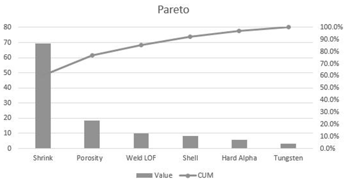
Figure TN.22: Pareto Chart
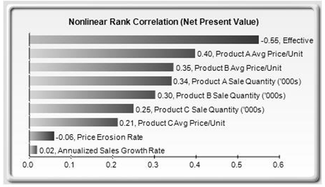
Figure TN.23: Dynamic Sensitivity Chart
If correlations are added between the simulation assumptions, sensitivity analysis will return a very different chart. Note that neither tornado analysis nor Pareto charts can capture these correlated dynamic simulated relationships. Only after a simulation is run will such relationships become evident in a sensitivity analysis. A tornado chart’s pre-simulation critical success factors and a Pareto chart’s cumulative effects charts will, therefore, sometimes be different from a sensitivity chart’s postsimulation dynamic critical success factor. The postsimulation critical success factors should be the ones that are of interest as these more readily capture the model precedents’ interactions.
In addition, the results of the sensitivity analysis include a report and two key charts. The first is a nonlinear rank correlation chart, as seen in Figure TN.23, that ranks from highest to lowest the assumption-forecast correlation pairs. These correlations are nonlinear and nonparametric, making them free of any distributional requirements (i.e., an assumption with a Weibull distribution can be compared to another with a beta distribution). The results from this chart are sometimes similar to that of the tornado analysis and Pareto charts, but sometimes the rankings might be different. This difference occurs because by itself, a certain input variable may have a significant impact, but once other variables are interacting in the model, this initial variable may have less of a dominant effect (this is especially true in a large model where correlations between input variables exist).
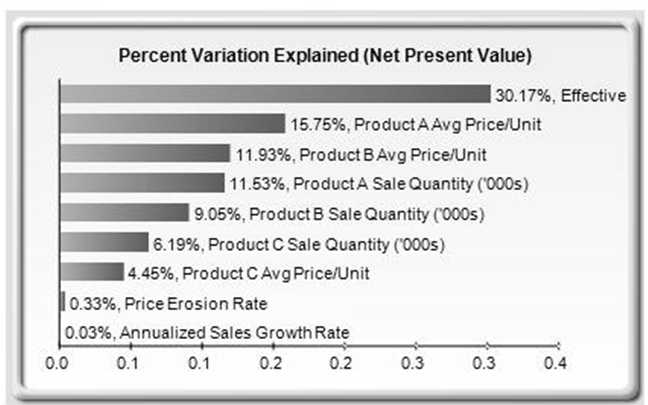
Figure TN.24: Percent Variation Explained in Dynamic Sensitivity Analysis
The second chart in a sensitivity analysis (Figure TN.24) illustrates the percent variation explained; that is, of the fluctuations in the forecast, how much of the variation can be explained by each of the assumptions after accounting for all the interactions among variables? Notice that the sum of all variations explained is usually close to 100% (sometimes other elements impact the model but they cannot be captured here directly), and if correlations exist, the sum may sometimes exceed 100% (due to the interaction effects that are cumulative).