Forecasting is a balance between art and science. Using Risk Simulator can take care of the science, but it is almost impossible to take the art out of forecasting. In forecasting, experience and subject-matter expertise count. One effective way to support this point is to look at some of the more common problems and violations of the required underlying assumptions of the data and forecast interpretation. Clearly, there are many other technical issues, but the following list is sufficient to illustrate the pitfalls of forecasting and why sometimes the art (i.e., experience and expertise) is important:
- Out-of-Range Forecasts
- Nonlinearities
- Interactions
- Self-Selection Bias
- Survivorship Bias
- Control Variables
- Omitted Variables
- Redundant Variables
- Multicollinearity
- Bad-Fitting Model or Bad Goodness-of-Fit
- Error Measurements
- Structural Breaks
- Structural Shifts
- Model Errors (Granger Causality and Causality Loops)
- Autocorrelation
- Serial Correlation
- Leads and Lags
- Seasonality
- Cyclicality
- Specification Errors and Incorrect Econometric Methods
- Micronumerosity
- Bad Data and Data Collection Errors
- Nonstationary Data, Random Walks, Non-Predictability, and Stochastic Processes (Brownian Motion, Mean-Reversion, Jump-Diffusion, Mixed Processes)
- Nonspherical and Dependent Errors
- Heteroskedasticity and Homoskedasticity
- Many other technical issues!
These errors predominantly apply to time-series data, cross-sectional data, and mixed-panel data. However, the following potential errors apply only to time-series data: Autocorrelation, Heteroskedasticity, and Nonstationarity.
Analysts sometimes use historical data to make out-of-range forecasts that, depending on the forecast variable, could be disastrous. Take a simple yet extreme case of a cricket. Did you know that if you caught some crickets, put them in a controlled lab environment, raised the ambient temperature, and counted the average number of chirps per minute, these chirps are relatively predictable? You might get a pretty good fit and a high R-squared value. So, the next time you go out on a date with your spouse or significant other and hear some crickets chirping on the side of the road, stop and count the number of chirps per minute. Then, using your regression forecast equation, you can approximate the temperature, and the chances are that you would be fairly close to the actual temperature. But here are some problems: Suppose you take the poor cricket and toss it into an oven at 450 degrees Fahrenheit, what happens? Well, you are going to hear a large pop instead of the predicted 150 chirps per minute! Conversely, toss it into the freezer at -32 degrees Fahrenheit and you will not hear the negative chirps that were predicted in your model. That is the problem of out-of-sample or out-of-range forecasts.
Suppose that in the past, your company spent different amounts in marketing each year and saw improvements in sales and profits as a result of these marketing campaigns. Further assume that, historically, the firm spends between $10M and $20M in marketing each year, and for every dollar spent in marketing, you get five dollars back in net profits. Does that mean the CEO should come up with a plan to spend $500M in marketing the next year? After all, the prediction model says there is a 5× return, meaning the firm will get $2.5B in net profit increase. Clearly, this is not going to be the case. If it were, why not keep spending infinitely? The issue here is, again, an out-of-range forecast as well as nonlinearity. Revenues will not increase linearly at a multiple of five for each dollar spent in marketing expense, going on infinitely. Perhaps there might be some initial linear relationship, but this will most probably become nonlinear, perhaps taking the shape of a logistic S-curve, with a high-growth early phase followed by some diminishing marginal returns and eventual saturation and decline. After all, how many iPhones can a person own? At some point, you have reached your total market potential and any additional marketing you spend will further flood the media airwaves and eventually cut into and reduce your profits. This is the issue of interactions among variables.
Think of this another way. Suppose you are a psychologist and are interested in student aptitude in writing essays under pressure. So, you round up 100 volunteers, give them a pretest to determine their IQ levels, and divide the students into two groups: the brilliant Group A and the not-so-brilliant Group B, without telling the students, of course. Then you administer a written essay test twice to both groups; the first test has a 30-minute deadline and the second test, with a different but comparably difficult question, a 60-minute window. You then determine if time and intelligence have an effect on exam scores. A well-thought-out experiment, or so you think. The results might differ depending on whether you gave the students the 30-minute test first and then the 60-minute test or vice versa. As the not-so-brilliant students will tend to be anxious during an exam, taking the 30-minute test first may increase their stress level, possibly causing them to give up easily. Conversely, taking the longer 60-minute test first might make them ambivalent and not really care about doing it well. Of course, we can come up with many other issues with this experiment. The point is, there might be some interaction among the sequence of exams taken, intelligence, and how students fare under pressure, and so forth.
The student volunteers are just that, volunteers, and so there might be a self-selection bias. Another example of self-selection is a clinical research program on sports-enhancement techniques that might only attract die-hard sports enthusiasts, whereas the couch potatoes among us will not even bother participating, let alone be in the media graphics readership of the sports magazines in which the advertisements were placed. Therefore, the sample might be biased even before the experiment ever started. Getting back to the student test-taking volunteers, there is also an issue of survivorship bias, where the really not-so-brilliant students just never show up for the essay test, possibly because of their negative affinity towards exams. This fickle-mindedness and many other variables that are not controlled for in the experiment may actually be reflected in the exam grade. What about the students’ facility with English or whatever language the exam was administered in? How about the number of beers they had the night before (being hungover while taking an exam does not help your grades at all)? These are all omitted variables, which means that the predictability of the model is reduced should these variables not be accounted for. It is like trying to predict the company’s revenues for the next few years without accounting for the price increase you expect, the recession the country is heading into, or the introduction of a new, revolutionary product line.
However, sometimes too much data can actually be bad. Now, let us go back to the students again. Suppose you undertake another research project and sample another 100 students, obtain their grade point average at the university, and ask them how many parties they go to on average per week, the number of hours they study on average per week, the number of beers they have per week (the drink of choice for college students), and the number of dates they go on per week. The idea is to see which variable, if any, affects a student’s grade on average. A reasonable experiment, or so you think… The issue, in this case, is redundant variables and, perhaps worse, severe multicollinearity. In other words, chances are, the more parties they attend, the more people they meet, the more dates they go on per week, and the more drinks they would have on the dates and at the parties, and being drunk half the time, the less time they have to study! All variables, in this case, are highly correlated to each other. In fact, you probably only need one variable, such as hours of study per week, to determine the average student’s grade point. Adding in all these exogenous variables confounds the forecast equation, making the forecast less reliable.
Actually, as you see later in this chapter when you have severe multicollinearity, which just means there are multiple variables (multi) that are changing together (co-) in a linear fashion (linearity), the regression equation cannot be run. In less severe multicollinearity such as with redundant variables, the adjusted R-square might be high but the p-values will be high as well, indicating that you have a bad-fitting model. The prediction errors will be large. While it might be counterintuitive, the problem of multicollinearity, of having too much data, is worse than having less data or having omitted variables. And speaking of bad-fitting models, what is a good R-square goodness-of-fit value? This, too, is subjective. How good is your prediction model, and how accurate is it? Unless you measure accuracy using some statistical procedures for your error measurements such as those provided by Risk Simulator (e.g., mean absolute deviation, root mean square, p-values, Akaike and Schwartz criterion, and many others) and perhaps input a distributional assumption around these errors to run a simulation on the model, your forecasts may be highly inaccurate.
Another issue is structural breaks. For example, remember the poor cricket? What happens when you take a hammer and smash it? Well, there goes your prediction model! You just had a structural break. A company filing for bankruptcy will see its stock price plummet and delisted on the stock exchange, a major natural catastrophe or terrorist attack on a city can cause such a break, and so forth. Structural shifts are less severe changes, such as a recessionary period, or a company going into new international markets, engaged in a merger and acquisition, and so forth, where the fundamentals are still there but values might be shifted upward or downward.
Sometimes you run into a causality loop problem. We know that correlation does not imply causation. Nonetheless, sometimes there is a Granger causation, which means that one event causes another but in a specified direction, or sometimes there is a causality loop, where you have different variables that loop around and perhaps back into themselves. Examples of loops include systems engineering where changing an event in the system causes some ramifications across other events, which feeds back into itself causing a feedback loop. Here is an example of a causality loop going the wrong way: Suppose you collect information on crime rate statistics for the 50 states in the United States for a specific year, and you run a regression model to predict the crime rate using police expenditures per capita, gross state product, unemployment rate, number of university graduates per year, and so forth. And further suppose you see that police expenditures per capita is highly predictive of crime rate, which, of course, makes sense, and say the relationship is positive, and if you use these criteria as your prediction model (i.e., the dependent variable is the crime rate and independent variable is police expenditure), you have just run into a causality loop issue. That is, you are saying that the higher the police expenditure per capita, the higher the crime rate! Well, then, either the cops are corrupt, or they are not really good at their jobs! A better approach might be to use the previous year’s police expenditure to predict this year’s crime rate; that is, using a lead or lag on the data. So, more crime necessitates a larger police force, which will, in turn, reduce the crime rate, but going from one step to the next takes time and the lags and leads take the time element into account. Back to the marketing problem, if you spend more on marketing now, you may not see a rise in net income for a few months or even years. Effects are not immediate, and the time lag is required to better predict the outcomes.
Many time-series data, especially financial and economic data, are autocorrelated; that is, the data are correlated to itself in the past. For instance, January’s sales revenue for the company is probably related to the previous month’s performance, which itself may be related to the month before. If there is seasonality in the variable, then perhaps last January’s sales are related to the last 12 months, or January of the year before, and so forth. These seasonal cycles are repeatable and somewhat predictable. You sell more ski tickets in winter than in summer, and, guess what, next winter you will again sell more tickets than next summer, and so forth. In contrast, cyclicality such as the business cycle, the economic cycle, the housing cycle, and so forth, is a lot less predictable. You can use autocorrelations (relationship to your own past) and lags (one variable correlated to another variable lagged a certain number of periods) for predictions involving seasonality, but, at the same time, you would require additional data. Usually, you will need historical data of at least two seasonal cycles in length to even start running a seasonal model with any level of confidence, otherwise, you run into a problem of micronumerosity or lack of data. Regardless of the predictive approach used, the issue of bad data is always a concern. Either badly coded data or just data from a bad source, incomplete data points, and data collection errors are always a problem in any forecast model.
Next, there is the potential for a specification error or using the incorrect econometric model error. You can run a seasonal model where there are no seasonalities, thus creating a specification problem, or use an ARIMA when you should be using a GARCH model, creating an econometric model error. Sometimes there are variables that are considered nonstationary; that is, the data are not well behaved. These types of variables are really not predictable. An example is stock prices. Try predicting stock prices and you quickly find out that you cannot do a reasonable job at all. Stock prices usually follow something called a random walk, where values are randomly changing all over the place. The mathematical relationship of this random walk is known and is called a stochastic process, but the exact outcome is not known for certain. Typically, simulations are required to run random walks, and these stochastic processes come in a variety of forms, including the Brownian motion (e.g., ideal for stock prices), mean-reversion (e.g., ideal for interest rates and inflation), jump-diffusion (e.g., ideal for the price of oil and price of electricity), and mixed processes of several forms combined into one. In this case, picking the wrong process is also a specification error.
In most forecasting methods, we assume that the forecast errors are spherical or normally distributed. That is, the forecast model is the best-fitting model one can develop that minimizes all the forecast errors, which means whatever errors that are left over are random white noise that is normally distributed (a normal distribution is symmetrical, which means you are equally likely to be underestimating as you are overestimating the forecast). If the errors are not normal and skewed, you are either overestimating or underestimating things, and adjustments need to be made. Further, these errors, because they are random, should be random over time, which means that they should be identically and independently distributed as normal, or i.i.d. normal. If they are not, then you have some autocorrelations in the data and should be building an autocorrelation model instead.
Finally, if the errors are i.i.d. normal, then the data are homoskedastic; that is, the forecast errors are identical over time. Think of it as a tube that contains all your data, and you put a skinny stick in that tube. The amount of wiggle room for that stick is the error of your forecast (and, by extension, if your data is spread out, the tube’s diameter is large and the wiggle room is large, which means that the error is large; conversely, if the diameter of the tube is small, the error is small, such that if the diameter of the tube is exactly the size of the stick, the prediction error is zero and your R-squared goodness-of-fit is 100%). The amount of wiggle room is constant going into the future. This condition is ideal and what you want. The problem is, especially in nonstationary data or data with some outliers, that there is heteroskedasticity, which means that instead of a constant diameter tube, you now have a cone, with a small diameter initially that increases over time. This fanning out (see Figure 12.44) means that there is an increase in wiggle room or errors the further out you go in time. An example of this fanning out is stock prices, where if the stock price today is $50, you can forecast and say that there is a 90% probability the stock price will be between $48 and $52 tomorrow, or between $45 and $55 in a week, and perhaps between $20 and $100 in six months, holding everything else constant. In other words, the prediction errors increase over time.
So, you see, there are many potential issues in forecasting. Knowing your variables and the theory behind the behavior of these variables is an art that depends a lot on experience, comparables with other similar variables, historical data, and expertise in modeling. There is no such thing as a single model that will solve all these issues automatically. See the sections on Data Diagnostics and Statistical Analysis in the previous chapters’ exercises for the two tools in Risk Simulator that help in identifying some of these problems.
Other than being good modeling practice to create scatter plots prior to performing regression analysis, the scatter plot can also sometimes, on a fundamental basis, provide significant amounts of information regarding the behavior of the data series. Blatant violations of the regression assumptions can be spotted easily and effortlessly, without the need for more detailed and fancy econometric specification tests. For instance, Figure 12.37 shows the existence of outliers. Figure 12.38’s regression results, which include the outliers, indicate that the coefficient of determination is only 0.252 as compared to 0.447 in Figure 12.39 when the outliers are removed.
Values may not be identically distributed because of the presence of outliers. Outliers are anomalous values in the data. Outliers may have a strong influence over the fitted slope and intercept, giving a poor fit to the bulk of the data points. Outliers tend to increase the estimate of residual variance, lowering the chance of rejecting the null hypothesis. They may be due to recording errors, which may be correctable, or they may be due to the dependent-variable values not all being sampled from the same population. Apparent outliers may also be due to the dependent-variable values being from the same, but non-normal, population. Outliers may show up clearly in an X-Y scatter plot of the data, as points that do not lie near the general linear trend of the data. A point may be an unusual value in either an independent or dependent variable without necessarily being an outlier in the scatter plot.
The method of least squares involves minimizing the sum of the squared vertical distances between each data point and the fitted line. Because of this, the fitted line can be highly sensitive to outliers. In other words, least squares regression is not resistant to outliers, thus, neither is the fitted-slope estimate. A point vertically removed from the other points can cause the fitted line to pass close to it, instead of following the general linear trend of the rest of the data, especially if the point is relatively far horizontally from the center of the data (the point represented by the mean of the independent variable and the mean of the dependent variable). Such points are said to have high leverage: the center acts as a fulcrum, and the fitted line pivots toward high-leverage points, perhaps fitting the main body of the data poorly. A data point that is extreme in the dependent variables but lies near the center of the data horizontally will not have much effect on the fitted slope, but by changing the estimate of the mean of the dependent variable, it may affect the fitted estimate of the intercept.
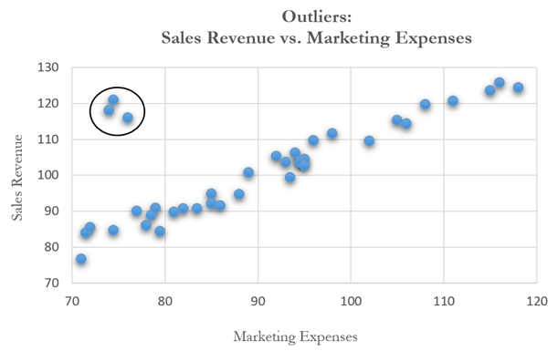
Figure 12.37: Scatter Plot Showing Outliers
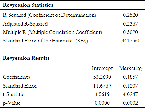
Figure 12.38: Regression Results with Outliers
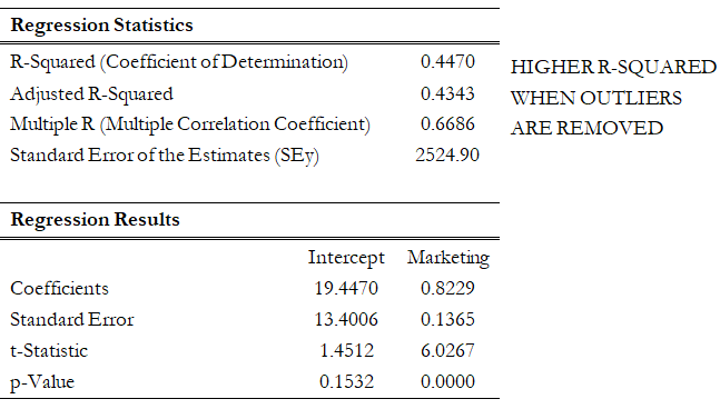
Figure 12.39: Regression Results with Outliers Deleted
However, great care should be taken when deciding if the outliers should be removed. Although in most cases when outliers are removed, the regression results look better, a priori justification must first exist. For instance, if one is regressing the performance of a particular firm’s stock returns, outliers caused by downturns in the stock market should be included; these are not truly outliers as they are inevitabilities in the business cycle. Forgoing these outliers and using the regression equation to forecast one’s retirement fund based on the firm’s stocks will yield incorrect results at best. In contrast, suppose the outliers are caused by a single nonrecurring business condition (e.g., merger and acquisition) and such business structural changes are not forecast to recur; then these outliers should be removed and the data cleansed prior to running a regression analysis.
Figure 12.40 shows a scatter plot with a nonlinear relationship between the dependent and independent variables. In a situation such as this one, linear regression will not be optimal. A nonlinear transformation should first be applied to the data before running a regression. One simple approach is to take the natural logarithm of the independent variable (other approaches include taking the square root or raising the independent variable to the second or third power) and regress the sales revenue on this transformed marketing-cost data series. Figure 12.41 shows the regression results with a coefficient of determination at 0.938, as compared to 0.707 in Figure 12.42 when a simple linear regression is applied to the original data series without the nonlinear transformation.
If the linear model is not the correct one for the data, then the slope and intercept estimates and the fitted values from the linear regression will be biased, and the fitted slope and intercept estimates will not be meaningful. Over a restricted range of independent or dependent variables, nonlinear models may be well approximated by linear models (this is, in fact, the basis of linear interpolation), but for accurate prediction, a model appropriate to the data should be selected. An examination of the X-Y scatter plot may reveal whether the linear model is appropriate. If there is a great deal of variation in the dependent variable, it may be difficult to decide what the appropriate model is; in this case, the linear model may do as well as any other and has the virtue of simplicity. Refer to the appendix on detecting and fixing heteroskedasticity for specification tests of nonlinearity and heteroskedasticity as well as ways to fix them.
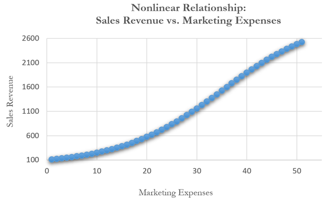
Figure 12.40: Scatter Plot Showing a Nonlinear Relationship
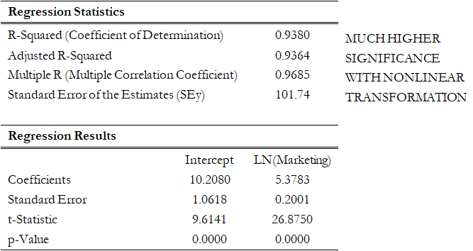
Figure 12.41: Regression Results Using a Nonlinear Transformation
However, great care should be taken here as the original linear data series of marketing costs should not be added with the nonlinearly transformed marketing costs in the regression analysis. Otherwise, multicollinearity occurs; that is, marketing costs are highly correlated to the natural logarithm of marketing costs, and if both are used as independent variables in a multivariate regression analysis, the assumption of no multicollinearity is violated, and the regression analysis breaks down. Figure 12.43 illustrates what happens when multicollinearity strikes. Notice that the coefficient of determination (0.938) is the same as the nonlinear transformed regression (Figure 12.41). However, the adjusted coefficient of determination went down from 0.9364 (Figure 12.41) to 0.9358 (Figure 12.43). In addition, the previously statistically significant marketing-costs variable in Figure 12.42 now becomes insignificant (Figure 12.43) with a probability or p-value increasing from close to zero to 0.4661. A basic symptom of multicollinearity is low t-statistics coupled with a high R-squared (Figure 12.43).
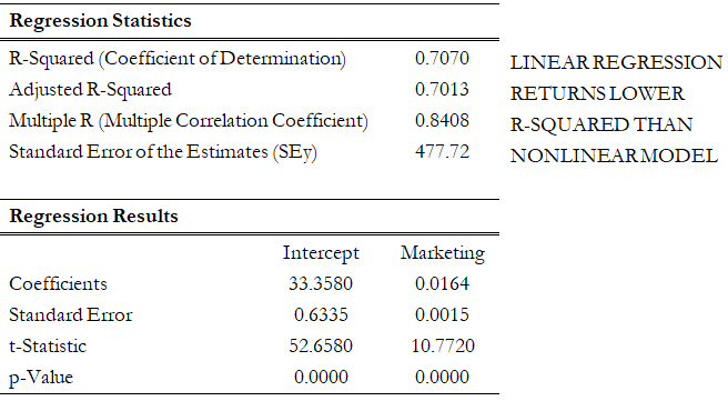
Figure 12.42: Regression Results Using Linear Data
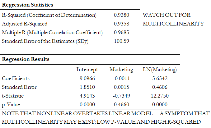
Figure 12.43: Regression Results Using Both Linear and Nonlinear Transformations
Another common violation is heteroskedasticity, that is, the variance of the errors increases over time. Figure 12.44 illustrates this case, where the width of the vertical data fluctuations increases or fans out over time. In this example, the data points have been changed to exaggerate the effect. However, in most time-series analyses, checking for heteroskedasticity is a much more difficult task. And correcting for heteroskedasticity is an even greater challenge. Notice in Figure 12.45 that the coefficient of determination dropped significantly when heteroskedasticity exists. As is, the current regression model is insufficient and incomplete.
If the variance of the dependent variable is not constant, then the error’s variance will not be constant. The most common form of such heteroskedasticity in the dependent variable is that the variance of the dependent variable may increase as the mean of the dependent variable increases for data with positive independent and dependent variables.
Unless the heteroskedasticity of the dependent variable is pronounced, its effect will not be severe: the least-squares estimates will still be unbiased, and the estimates of the slope and intercept will either be normally distributed if the errors are normally distributed or at least normally distributed asymptotically (as the number of data points becomes large) if the errors are not normally distributed. The estimate for the variance of the slope and overall variance will be inaccurate, but the inaccuracy is not likely to be substantial if the independent-variable values are symmetric about their mean.
Heteroskedasticity of the dependent variable is usually detected informally by examining the X-Y scatter plot of the data before performing the regression. If both nonlinearity and unequal variances are present, employing a transformation of the dependent variable may have the effect of simultaneously improving the linearity and promoting equality of the variances. Otherwise, a weighted least-squares linear regression may be the preferred method of dealing with a nonconstant variance in the dependent variable.
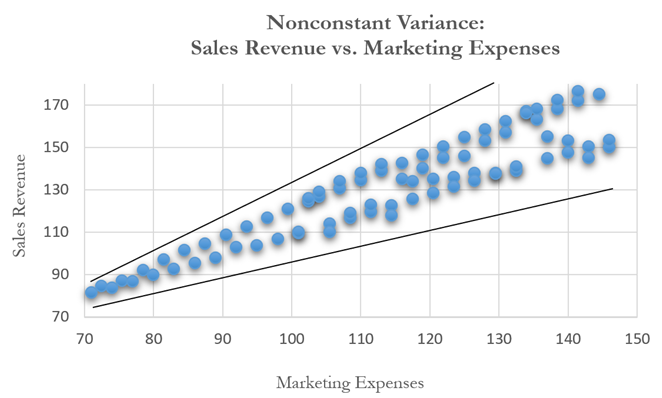
Figure 12.44: Scatter Plot Showing Heteroskedasticity with Nonconstant Variance
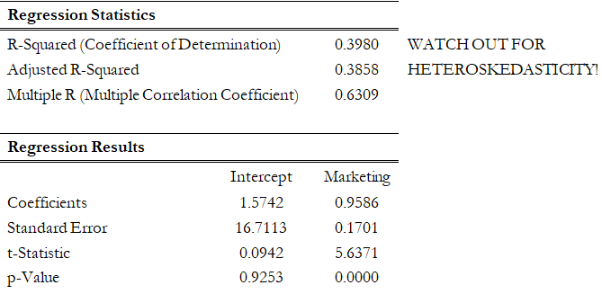
Figure 12.45: Regression Results with Heteroskedasticity