After the simulation completes its run, go to the Simulation Results tab (Figure 5.2 shows the DCF module’s default example’s risk simulation results after running the Simulate All Options at Once selection). First, select the output variable you wish to display using the drop-down list. The percentiles and simulation statistics are presented on the right, and the simulation forecast chart is shown on the left. You can change the chart type (e.g., PDF, CDF), enter Percentiles (in %) or Certainty Values (in output units) on the bottom left of the screen (remember to click Update when done) to show their vertical lines on the chart, or compute/show the Percentiles/Confidence levels on the bottom right of the screen (select the type, Two Tail, Left Tail, Right Tail, then either enter the percentile values to auto compute the confidence interval, or enter the confidence desired to obtain the relevant percentiles). Note that the bottom right section for percentiles and confidence levels is used to both show the vertical lines on the chart as well as to compute the statistical results (i.e., entering the percentile value automatically computes the corresponding confidence value, whereas entering the confidence level automatically imputes the corresponding percentile value) as compared to the section on the bottom left where it is used only to draw the vertical lines on the chart.
You can also Save the simulated results and Open them at a later session, Copy Chart or Copy Results to the clipboard for pasting into another software application, Extract Simulation Data to paste into Excel for additional analysis, modify the chart using the chart icons, and so forth.
The simulation forecast chart is highly flexible in the sense that you can modify its look and feel (e.g., color, chart type, background, gridlines, rotation, chart view, data labels, etc.) using the chart icons. To illustrate, if you entered either a Percentile or Certainty Value at the bottom left of the screen and clicked Update, you can then click on Custom Text Properties (Figures 5.3 and 5.4), select the Vertical Line, type in some custom text, click on the Properties button to change the font size/color/type, or use the A icons to move the custom text’s location. Please note that the custom text properties box will be empty unless you have at least one vertical line (bottom left section).
Finally, note that the Simulation Results forecast chart shows one output variable at a time, whereas the Overlay Results compares multiple simulated output forecasts at once.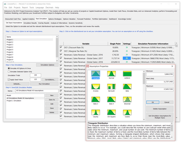
Figure 5.1 – Risk Simulation: Set Input Assumptions
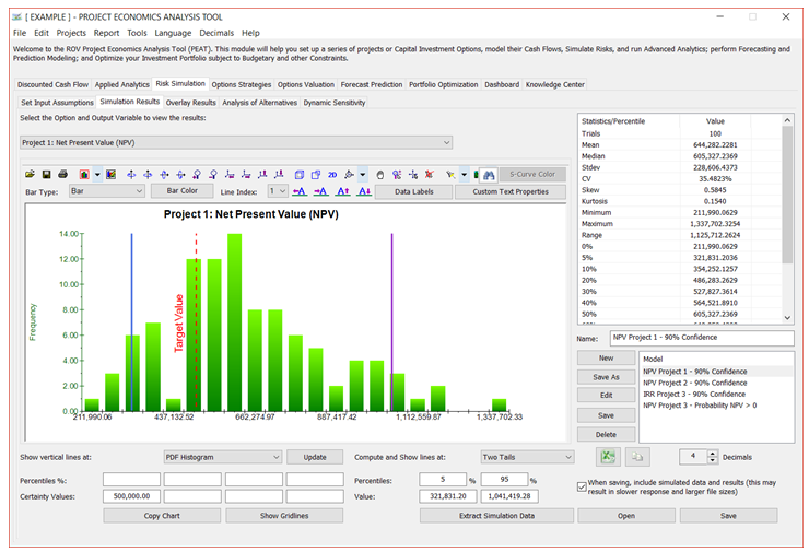
Figure 5.2 – Risk Simulation: Simulation Results
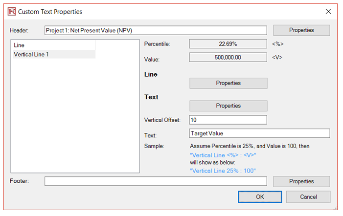
Figure 5.3 – Risk Simulation: Custom Text
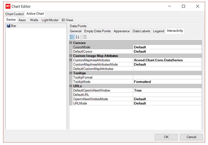
Figure 5.4 – Risk Simulation: Customizing Simulation Forecast Charts