Distributional Charts and Tables is a new Probability Distribution tool that is a very powerful and fast module used for generating distribution charts and tables. Note that there are three similar tools in Risk Simulator but each does very different things:
- Distributional Analysis: Used to quickly compute the PDF, CDF, and ICDF of the 50 probability distributions available in Risk Simulator, and to return a probability table of these values.
- Distributional Charts and Tables: The Probability Distribution tool described here used to compare different parameters of the same distribution (e.g., the shapes and PDF, CDF, ICDF values of a Weibull distribution with Alpha and Beta of [2, 2], [3, 5], and [3.5, 8], and overlays them on top of one another).
- Overlay Charts: Used to compare different distributions(theoretical input assumptions and empirically simulated output forecasts) and to overlay them on top of one another for a visual comparison.
SHAPES OF DISTRIBUTIONS
The following illustrates how multiple probability distribution charts can be developed and compared against each other.
- Run Risk Simulator | Analytical Tools | Distributional Charts and Tables, click on the Apply Global Inputs button to load a sample set of input parameters or enter your own inputs and click Run to compute the results. The resulting four moments and CDF, ICDF, PDF are computed for each of the 50 probability distributions (Figure TN.25).
- Click on the Charts and Tables tab (Figure TN.26), select a distribution (e.g., Beta 4), then choose if you wish to run the CDF, ICDF, or PDF, enter the relevant inputs, and click Run Chart. You can switch between the Chart and Table tab to view the results as well as try out some of the chart icons to see the effects on the chart.
- You can also change two parameters to generate multiple charts and distribution tables by entering the From | To | Step input after selecting the relevant Change First and Second Parameter droplists; then hit Run. For example, as illustrated in Figure TN.26, run the Beta 4 distribution and select PDF, select Alpha and Beta to change using the custom droplists, and enter the relevant input parameters: 3; 5; 2 for the Alpha inputs and 2; 4; 2 for the Beta inputs, and click Run Chart. This will generate four Beta 4 distributions: Beta 4 (3, 2, 10, 2), Beta 4 (3, 4, 10, 2), Beta 4 (5, 2, 10, 2), and Beta 4 (5, 4, 10, 2). Explore various chart types, gridlines, language, and decimal settings, and try rerunning the distribution using theoretical versus empirically simulated values.
- Figure TN.27 is the same set of distributions viewed under the CDF selection with gridlines turned on. Notice that the decimal has been set to 1 and the labels have been moved to different locations for the sake of clarity of the charts. Use the Index number droplist (default is 1) and +A, –A, ←A, →A, A↑, and A↓ icons (located immediately above the chart) to resize and move the labels. The index droplist is for you to select which chart line’s labels you wish to manipulate.
- Figure TN.28 illustrates the probability tables generated for a binomial distribution where the probability of success and number of successful trials (random variable X) are selected to vary using the From | To | Step option. Try to replicate the calculation as shown and click on the Table tab to view the created CDF This example uses a binomial distribution with a starting input set of Trials = 20, Probability (i.e., the probability of success for each trial) = 0.5, and Random X (the number of successful trials) = 10, where the Probability is allowed to change from 0.1, 0.2, …, 0.9 and is shown as the row variable, and the Number of Successful Trials is also allowed to change from 0, 1, 2, …, 20, and is shown as the column variable. CDF is chosen and, hence, the results in the table show the cumulative probability given that the number of successful events occurs under various probabilities of success.
- Finally, Figure TN.29 shows the Compare Charts subtab where PDF and CDF curves from different probability distributions can be overlaid on top of one another to compare their characteristics. The example shown has the PDFs of the gamma and Weibull distribution Start by going to the Charts and Tables | Compare Charts subtab, and select the Weibull distribution. Enter Alpha = 2 and Beta = 5 and click Add. Then, select the Gamma distribution and enter the same alpha and beta values, and click Add. Finally, click Run Chart to see the resulting distributions.
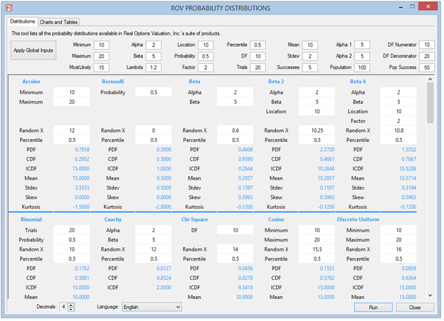
Figure TN.25: Distributional Charts and Tables Tool
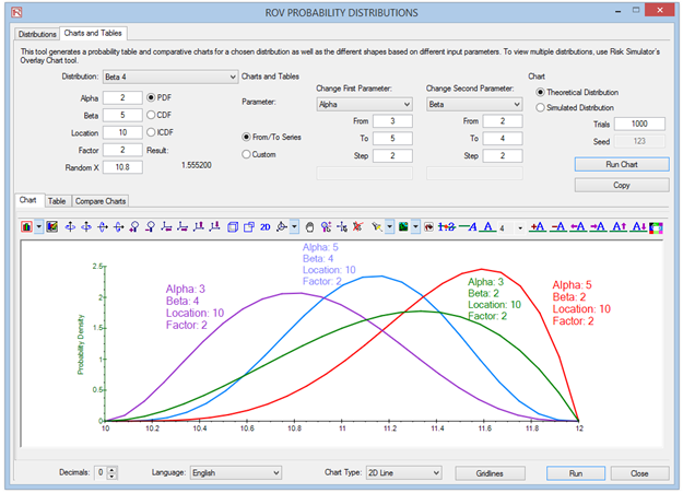
Figure TN.26: Overlaying Multiple PDF Charts
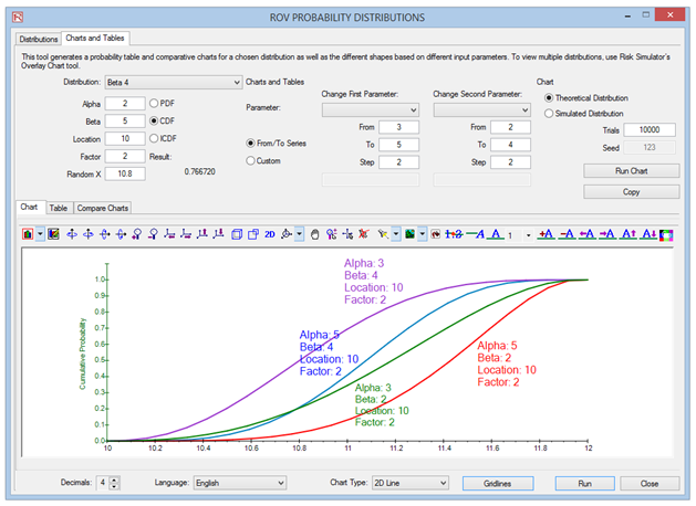
Figure TN.27: Overlay CDF Charts with Gridlines
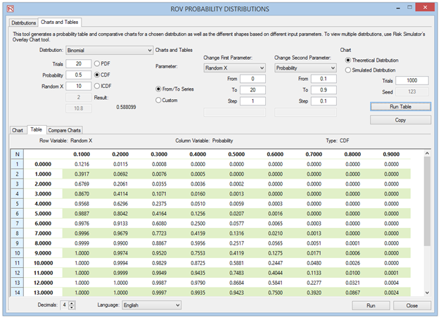
Figure TN.28: Probability Tables
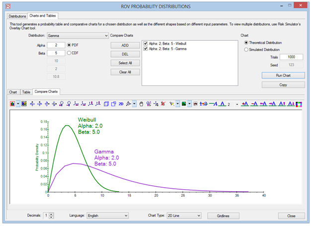
Figure TN.29: Overlay and Compare Different Distributions